One of the more interesting customer giveaways at the National Stationery Show came from Independent Greetings, specializing in on-demand printing. As my friend C's small company does some specialized card printing, she took a number of their samples and I also received one of their padfolios--a medium-sized orange vinyl book with a notepad on one side, a Uni-ball fine point pen in the middle, and sample cards in an accordion on the other side.
Looking it over, I realized that one of my favorite notepads might just fit into this. So I found one, played around with it and found that a Rhodia No. 16 pad will fit quite nicely. That the padfolio is a dark orange with black trim and elastic enclosure is a bonus, matching the Rhodia colors quite nicely. Definitely a keeper, so my thanks to Independent!
Journals and notebooks, fine papers and pens, inks and their ilks, a few other things, and the occasional rant
Friday, May 28, 2010
Thursday, May 27, 2010
Penmanship via Google Books
I was paging through Google Books' Penmanship of the XVI, XVII and XVIIIth Centuries, amazed at the beautiful handwriting, when I came across the above scan. I love the pink latex fingers!
Mean Cards at the NSS
Another snarky card company we saw at the National Stationery Show was Mean Cards, stories of daily peril both real and imagined. They had some of the best drawings and tag lines, and the booth was set up with large and small framed cards. The art work reminds me of xkcd which I'm sure (ha ha) is a coincidence.
Check out the Mean Cards website where you can find retailers in your area, as well as jump to their blog. They also have an iPhone App, and you can follow them on Twittter @MeanCards.
The card above reads: Enough with the iPhone/it doesn't love you back (there's no app for that).
Check out the Mean Cards website where you can find retailers in your area, as well as jump to their blog. They also have an iPhone App, and you can follow them on Twittter @MeanCards.
The card above reads: Enough with the iPhone/it doesn't love you back (there's no app for that).
Publish Post
Wednesday, May 26, 2010
Which One is the Dog?
From a website that features cute pictures of sleeping animals, here's a Shar Pei conked out on a bath towel.
Kum Pencil Sharpeners at the NSS
Walking around the National Stationery Show I spotted several booths carrying Kum pencil sharpeners. Eventually my friend C and I found the Kum booth, and had a fairly long talk with a very patient and generous rep--he gave us each a 1-hole brass sharpener and a Correc-Tri Sharpener and Eraser.
I am absolutely amazed at this small 1-hold brass sharpener--it really is sold brass and heavy. According to the literature, the sharpener is a standard wedge profile and precision-made of milled massive brass. There is a recessed grip zone so you have a firm hold while sharpening a pencil; a carbon-steel blade, and a hammered and polished surface.
According to one website, the sharpener's high-carbon steel cutting blade features Dynamic Torsion Action. DTA enables the dual task of cutting hard graphite while shaping soft wood, so the blade can be flexible or rigid as needed. In addition to all this, the steel blade is protected against rust by careful polishing, eco-friendly (of course!) ultrasonic cleaning, and by a micro-thin oil coating.
The Correc-Tri Sharpener & Eraser has a 1-hole magnesium alloy sharpener, and comes with a waste container, a translucent non-smear eraser, and a pencil hole cap. It's available in orange or blue, and the triangular shape makes it a stand-out in the pencil case.
Of course, I'm not much on pencils but I think that will change now that I have my Kum brass sharpener. But what about the Correc-Tri? Maybe a giveaway next week? Hmmmm.
Tuesday, May 25, 2010
How to Stop Pen Thieves & Forgetful Borrowers
Here's an interesting way to stop pen thievery and those memory-impaired, "did I borrow your pen?" friends: the Borrow My Pen Collection of 8 screen-printed pens. How does this stop someone from taking your pen? It's what's printed on the pen that keeps people away. Bottomless buffet, anyone?
- Springfield Sexual Addiction Center
From PERV to PERFECT in as little as 10 days. Curbing your enthusiasm since 1998. - Shecky The Clown
Bar Mitzvahs, Weddings, Interventions. Don't forget Shecky's dog Arlene, a little extra but worth it. - Electrolysis Is Us
The first name in unwanted hair removal. Specializing in those hard-to-reach areas - Dr. Lance Hughes, Proctology
Turn your head and cough, 301 South Main (please use rear entrance) - Van Nuys Center for Cosmetic Surgery
Specializing in difficult gender reassignments - Verdant Fields Nudiest Camp
Get in touch with your OUTER self! Enjoy ping pong, volleyball and our famous bottomless buffet - Stuffed with Love Taxidermy
No pet too small - give us a call! (ask about our goldfish and turtle discount) - Howie's House of Hair
From barely there to awesome hair in just one hour
Black Pencils at the NSS
One of the interesting details at the National Stationery Show last week was the abundance of black pencils with jeweled caps. Everywhere you looked booths had them as adornments and sale items. Several booths were dedicated exclusively to black pencils and they also had different types of caps you could buy to adorn the pencil ends if you wanted something other than colored jewels.
Above is one of the jeweled cap pencils I received at one of the booths (as I was drooling over the all-graphite, wood-less pencils on display). This black one with the orange jewel has a soft, smeary lead (possibly a B), and because of that it may not be used much for writing. But I'll find something to do with it, I'm sure. It's really very pretty as is, so I could just keep it on my desk for general admiration.
Monday, May 24, 2010
Zebra Sarasa 0.7m Gel Ink Pen in Red
I like the Zebra Sarasa gel ink pens for their distinctive look and sharp line, as well as some of the great colors in the line. This one really caught my eye, a very distinctive, deep red that at first I thought had some brown in it. But on looking more closely, it seems to be a very deep wine color but not in the purple family at all. Burgundy is the closest I can come up with but there may be another name for this color.
The pen itself has a soft rubber grip in matching dark red, and the ink line is thick and crisp. A great writing pen, and the color really gets your attention. Match it with a Doane Paper notepad and you're set.
Update: Per Zebra Pens, the official name of this color is Mahogany. My pen just said "red/rouge" so that's good to know. There is some brown in it.
Friday, May 21, 2010
One Slice or Two?
In New Orleans, a neighborhood store named Breaux Mart made a very special cake to thank BP for all it's done on their behalf (via skooksie's photo streak on flickr).
Hall of Fame and Desert Isle Pens
Victo commented on the Paper Mate Felt Tip post about inducting that pen into a Hall of Fame, with Jack/Youngstown following up with thoughts about a "desert isle pen" as well as historical/fantastical writing instruments. Which then led me to think about Victo's other comment, that a desert isle theme would be an interesting post.
I've always wondered about J. Herbin ink's one particular customer, Napoleon. What color ink did he use? Likely blue or black, or maybe a combination? Did J. Herbin make a special ink to celebrate Napoleon's (self) coronation as Emperor? What colors were available in 1804?
On the fantasy side, did Gandalf use a fountain pen or a rollerball? What nib--I'm thinking broad, but he might have been a fine point wizard.
What pen (and bottle of ink, if it's a fountain pen) would you want to have with you if you were stranded on a desert isle (with the Professor at the very least, since he could probably make more ink and nibs)?
And if you thought to bring a pen and ink with you, then you also probably had a waterproof, plastic bag containing paper when you swam to shore so you could write down your thoughts while waiting for a passing Carnival Cruise ship to pick you up. What kind of paper would you take?
I am leaning towards my Namiki Falcon II fountain pen with a soft fine flexible nib, and a bottle of Iroshizuku ink. Haven't decided what color yet, but eventually I'll figure it out. And maybe some Rhodia dotPads? I just saw the large, 32 inch dotPad at the National Stationery Show and loved it!
Comments?
Thursday, May 20, 2010
Whitelines at the National Stationery Show
Got to see some of the Whitelines pads and notebooks at the National Stationery Show, and picked up a 2010 catalog as well.
What's new for the year is the black cover, which I really love. In addition, there is a Slim wire notebook (above pic, measuring 5.8 x 11.7) which has been very popular.
The Whitelines Third Dimension, a new Orange-glued pad optimized for 3-D drawings and sketches).
And an 18 month Whitelines Diary. Great new products and now in basic black!
Wednesday, May 19, 2010
Twisted Tidings Cards at the NSS
Sunday walking the floor of the National Stationery Show at the Javits Convention Center, I was about to say to my friend C that I was getting tired of all the greeting card booths carrying sunny, chirpy messages of joy and happiness. After miles of sugar, I wanted a little vinegar: a card that said something like "J*erk off, you j*erkoff."
Before I could say anything C started laughing and pointed to a booth, featuring a photo of a young couple and their baby. But on closer inspection both parents looked glassy-eyed and dazed; mom was slinging the baby on her lap like it was a baguette, and the bottle in its mouth was a fifth of Jack Daniels. Dad was holding a prescription pill bottle in his lap the size of the Chrysler Building, and his look of dazed happiness was courtesy of a pharmaceutical company's R&D department and not from an hour of yoga.
Welcome to Twisted Tidings Greeting Cards. Their cards are snarky, evil, risque, and more. The above card is one of the few I feel comfortable posting without deleting words and phrases. The front message says: A special birthday milestone. Inside is the kicker: You've finally become that creepy older guy in the club. Happy Birthday!
What really made us laugh was the show giveaway, an ecologically correct shopping bag with a particular advertisement I've often thought was the real message. After all, we may be carrying reusable bags to help save the environment, but there's another agenda being pursued as well.
Look for Twisted Tidings cards in your local stationery store, or email them for retailers in your area. You can also follow them on Twitter, @TwistedTidings.
Tuesday, May 18, 2010
Ecosystem's New Products at the National Stationery Show
Ecosystem was easy to find at the National Stationery Show, just read the signs as you go through the doors at the Javits Convention Center.
Or, after you registered, if you wanted to see the newest products and the top picks of 2009 at the Entrance display, there was Ecosystem front and center. Before taking this picture I posed the purple notebook in the front center as it is their newest color: Grape! To celebrate, Ecosystem reps were handing out grape bead necklaces and grape soda at their booth to announce this addition to their color line.
In addition to the great Grape color, I got to see (and take a few pics) of their newest products coming out in the Fall. First, on the right of the above pic, are their new Reporter-style notepads in four sizes (these are the green/black and blue/watermelon notepads above). They are flexible reporter notepads for taking notes, doodling, whatever, and they have a recycled cotton elastic closure at the bottom so the notebook doesn't suddenly open up. This is a great addition to the Ecosystem lineup, and with four different sizes and all the different colors you could spend hours trying to decide which one is right for you.
To the left are the new Sketchbooks (starting with the watermelon/purple combination and moving to the left with the blue and clementine). These are sketchbooks with white blank 80gsm paper; like the reporter-style, the Sketchbook also has a recycled cotton elastic closure on the side. Rhodia quality paper with a Moleskine band, I'm thinking these will be perfect for fountain pens as well as graphite. There were medium and large sketchbooks on view, so again there will be lots of colors and sizes to choose from when they hit the stores. The roll out time is the Fall, and I plan on keeping a close eye on the Ecosystem display at my Union Square Barnes and Noble (as well as their Twitter account, @ecosystemlife) for the notebook's arrival.
I think of all the booths I stopped by at the NSS, this was one of my favorites. I'm really excited by these Reporter and Sketchbook additions to the Ecosystem line, and the new great Grape notebook color.
Monday, May 17, 2010
Safari Ltd., Toys Inspired by Nature
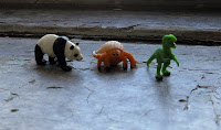
One of the first stops at the National Stationery Show on Sunday was Safari Ltd., which makes museum quality creative toys that range in size from the tiny (as pictured above) to the large.
Founded in 1980, Safari began as an educational toy company. The quality and detail of their replicas is stunning, each piece handpainted and life-like (and can be used as a teaching tool or just a great collectible). In the pic above is the panda, the hermit crab, and the T-rex (the hippo seems to have disappeared), all with details painted in such as the dinosaur's red tongue and the crab's black claw tips. In addition to real animal replicas, their fantasy dragons, mythical creatures, and fairy folk are also detailed and astounding.
The company supports a number of organizations that work in the field of conservation, animal protection, and ecologically sound business practices. All in all, Safari Ltd. has a really great product. I'm not sure where they retail, but I'm going to look for their replicas when I next visit the American Museum of Natural History.
Update: Found the hippo, the pic is a bit blurry but I think you can still see the detail. Next to it is a quarter, so you get an idea of how small this is yet so amazingly life-like. The pink mouth and white teeth are incredibly.
You can also follow Safari Ltd. on Twitter @SafariLtd.
Saturday, May 15, 2010
National Stationery Show Starts Tomorrow
The National Stationery Show begins tomorrow through Wednesday at the Javits Center in New York City. Hundreds of vendors with lots of stationery, notebooks, notepads, leather good,s and other products to show off. My friend's mom signed up (she has her own small store in Brooklyn), and I got an invite to attend as well. Can't wait to see all the paper and accessories, and check out the Rhodia/Quo Vadis booth, say hellow to Whitelines, and just walk the Javits Center.
Thursday, May 13, 2010
Paper Mate Felt Tip Pen
An all-time favorite of mine and one of the simpler pleasures of life, the Paper Mate Felt Tip Pen is a porous, liquid felt tip pen that made its debut in 1966 and has become an industry standard.
When capped, the hard molded plastic barrel is thick in the middle and tapered at the ends; posted, the barrel shows the indented tapering of the barrel down to the tip. I've always wondered if the top could become "mushy" from too much pressure being applied to it when writing, but that never happened as far as I remember. The tip really resists fraying and squashing--it's a Percheron of a pen, even though it looks like an Arabian.
I think I first started using these around 1970 or so, when they were the hip writing instrument. The ink isn't bulletproof and was never meant to be, but the 1.10m tip drew a thick, solid line just like a magic marker but in an elegant-looking package. The ink doesn't bleed through, and later on Paper Mate included pastel colors in the Flair line up for more choices. My favorite was always the purple Flair, so I couldn't resist getting one on a recent trip to the stationery store.
Wednesday, May 12, 2010
Rhodia No. 19 Yellow Lined Notepad
One of my favorite notepads is the Rhodia No. 19 yellow lined pad. It's slightly larger than a regular letter-sized notepad (8.3 x 12.5 vs. 8.5 x 11) which is great for writing and taking lots of notes. But it's really the color of the paper that gives this a unique quality. The No. 19's yellow paper is much brighter than regular "foolscap" and the right margin line is larger as well, giving it a very different look and feel. Above, the pic compares a regular notepad with the Rhodia No. 19. For some reason I couldn't find any legal-sized notepads around, so I grabbed some copy paper for a comparison. Kind of like Goldilocks and the Three Bears, the middle one for me seems "just right."
The pic above left is blurry, but you can still see how much brighter the Rhodia yellow pad is than the Ampad. There's something very crisp and clear about this notepad, and like other Rhodia pads it's made with 80gsm high grade vellum paper. So fountain pen ink doesn't bleed through, though it leaves a shadow. My only thought is that I'd like to see this with a black cover, otherwise it's a perfect notepad.
Monday, May 10, 2010
Interesting Item at Art Brown
I've been looking over the Art Brown web site, as the Pen Fair is this week and I'll be dropping by on Wednesday to look at a few pens and purchase a few items (a new bottle of Iroshizuku ink is planned, among other things).
While looking at the Pilot inks, this came up--a Pilot Vanishing Point Metal Pen Cap. I have to say that my Pilot vanishing point decimo has always worried me a bit as there is no cap and no way to make sure ink doesn't drip out. This would do the trick, I'll have to bring my pen and give it a try.
Montblanc Mystery Black Ink
Decided on my trip to the Fountain Pen Hospital last week to add a bottle of Montblanc ink to my collection, if nothing more than to have one of their distinctive ink bottles. I have a lot of blue inks, but very few blacks--the Noodler's and Montblanc increased my collection 100%, for a total of 4 (or 3.5 really, since one ink is a limited edition bottle half the size of a regular ink).
What was surprising was then I swatched the shades to get a sense of the different blacks. The Montblanc Mystery Black was quite thin and almost watery on the paper, even thought I made sure to shake the bottle so that there was no possible separation. The Mystery Black also has a definite purple hue to it that I rather like, although this picture doesn't show the shading very well. I think you can see it best in the last streak of color on the bottom of the swatch.
Interestingly, J. Herbin's Perle Noir was a medium black, definitely a nice dark shade but also a bit thin on color. The surprise was Noodler's Old Manhattan Blackest Black. This really is the blackest black ink of the three, it looks like liquid coal it's so dark.
Now the test for the Montblanc Mystery Black is to see what it looks like in writing. I've loaded up my Pelikan M205 Clear Blue fine nib fountain pen and will compare it to the Noodler's Old Manhattan still in my Parker Latitude. Should be interesting, and I'll have more to report at a later date.
Thursday, May 6, 2010
Whatever Blog's 1st Anniversary and Giveaway
Do go visit Julie (Okami) at Whatever and wish her a happy anniversary. She's giving away an Orange Lamy Safari fountain pen as part of the celebration, so leave a comment and enter to win!
De Atramentis 12 Ink Gift Box
Art Brown is featuring this De Atramentis Gift Box, with twelve of the wine-based inks in a wooden presentation box. That is some gift box ($250 is a lot, but it's Art Brown and De Atramentis and I'm not buying one so I don't really care about the price, lol). Almost makes me think I should have a sommelier present when I ink up a pen ("I don't think a Bordeaux would go well with your Namiki Falcon II").
Parker Latitude Fountain Pen
Here is one of my recent purchases from the Fountain Pen Hospital, a Parker Latitutde medium nib fountain pen in Silky Black. The pen is on sale at FPH for 50% off, which made it even more attractive. This is my first Parker, fountain pen or otherwise and I'm definitely curious to see how well it compares to my beloved Pilot Namiki pens.
Among the pros are the elegance of the pen itself, the matte silky black barrel and gold accents, as well as the six gold rings around the cap (which I believe has something to do with planets in their motions around the sun). The pen comes with an interesting-looking converter so I didn't have to go looking for one, and will take long and short cartridges as well.
Cons? Ink creep on the nib, and the flow is not consistent. But I'm using the Noodler's Old Manhattan Blackest Black, so that might make a difference. I've heard some FP enthusiasts mention that their favorite pens don't care for Noodler's, so maybe I'll try another ink and see if I get the same problems.
While I'm not fond of medium nibs, I've gotten to like this one quite a bit. There's something about the shape of the nib that seems different--a bit squatter and broader than most of my sleek Japanese and German pens.
Wednesday, May 5, 2010
Muji Gel Ink RT (Violet)
Another Muji gel ink retractable I bought, besides the Steel Blue that I posted about last week, is this Violet ink pen. Or at least that's what I'm calling it. Muji has a retractable in a deep purple color, and then there is this one with a lighter shade plunger that would seem to be violet. But when you write with it (0.5mm, btw), the color is much different.
Next to my Hi-Tec Violet 0.5mm, the Muji Violet looks like a true purple, with a lot more blue in it than the Hi-Tec. What I also didn't realize is that the Muji RT is quite a bit smaller than a Hi-Tec, almost half an in with the plunger depressed. The Muji RT Violet is a very pretty color, definitely not as light as the polycarbon barrel color would have you believe. If you're looking for a dark, true purple then this is for you.
Tuesday, May 4, 2010
It's Carnival Time Again
The 10th Carnival of Pen, Pencil and Paper is now up and running, hosted by Julie (Okami) at Whatever. Stop by and take a look, have a funnel cake, and enter the coin toss for a cute goldfish (ahhh, memories of the Great Allentown Fair).
Tiger Pens Blog will host the 11th Carnival on June 8, stop by if you get a chance.
Monday, May 3, 2010
Noodler's Old Manhattan Blackest Black Ink
I'm not much on black ink, it's a standard color that (like the little black dress) goes with everything. But on a recent trip to the Fountain Pen Hospital while on jury duty I saw this Noodler's FPH exclusive and decided to try it out. I love the picture of Old Manhattan, the Pilgrims are just getting off the Mayflower. But what about the ink, is it blackest black?
I decided to try it against J. Herbin's Perle Noir to get a sense of the blackness of the ink and what other colors might show. The Noodler's ink is like a light paint, very pigmented and dark. The J. Herbin swabbed like colored water, the ink seemed thinner and watery. When the inks dried, they looked very similar however. The Noodler's does seem to have a slightly green undertone to it, while the J. Herbin seems not to have any other color shading in it. The Noodler's is an Eternal ink, guaranteed to last and not wear or fade. Definitely a very nice black, and one that is a great addition to my ink collection.
Subscribe to:
Posts (Atom)