Showing posts with label Noodler's. Show all posts

Wednesday, December 21, 2011

Noodler's Blue Nose Bear Ink


Here's a quick review of Noodler's Blue Nose Bear ink, which is one of the softest and loveliest blue-green inks I've ever seen. (If you click on that link, definitely scroll down and cCheck out the two videos Goulet Pens has posted showing off Blue Nose Bear.) I'm using one of the new Noodler's Ahab flex nib fountain pens, and the nib is very big and flexible so you get a good idea of how this ink looks.

The ink seems to be very wet in the Ahab, flowing all over the place and I actually had a few spatters on the page. As I wasn't pressing very hard on the nib, I presume it's the ink. We'll see when I try it in one of my Japanese fine nibs, then it might be better behaved.

The paper I was using was an 80gsm stock I have on hand (Rhodia quality, if you will). I was very surprised at how much bleed through there is with Blue Nose Bear, double-sided writing isn't going to work too well with this ink--at least not using the Ahab flex, but maybe with a finer nib.

Drying time and water resistance are average--it's a wet ink, so expect it to take some extra seconds to saturate the page (perhaps a bit too much) and dry, and it's not waterproof so getting it wet will lead to ink running off the page. It does have some fluorescence to it, and it is forgery-resistance if those qualities are of interest. But if color is your thing and you are looking for a new blue-green with exceptional shading, then Blue Nose Bear is for you.

Monday, August 8, 2011

Noodler's Black Swan in Engish Roses

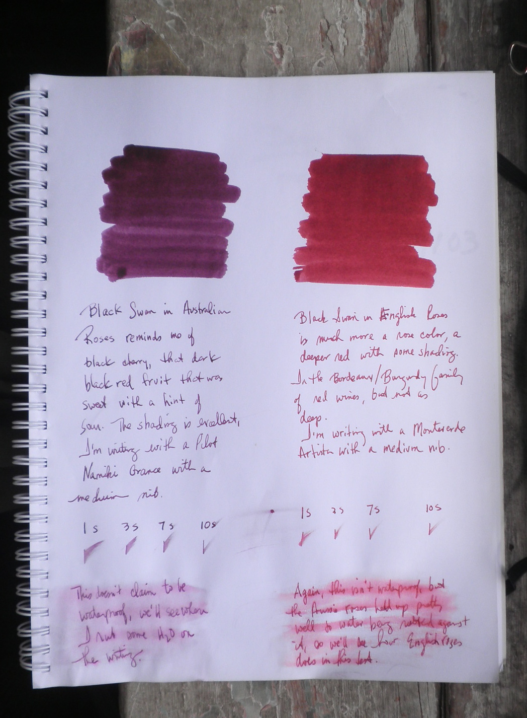
The second of the Black Swan inks is Black Swan in English Roses, which is much different from its Australian cousin (as you can see in the picture to the right that compares the two Swans).

English Roses is a deep, bright burgundy, reminding me of the wine inks of De Atramentis. It has more in common with a poppy than a rose (as Nathan Tardiff notes in his video). The ink's shading is beautiful but understated to my eye.

By contrast, Australian Roses is a black cherry color, and has a much heavier shading quality to the ink. It's a much darker color and doesn't have the brightness of English Roses.

Drying time is neither very quick nor very slow, just a regular Noodler's ink drying on the page. The paper I used isn't in the Rhodia/Clairefontaine category, but a bit better than copy paper.

The Roses inks aren't waterproof, but I was surprised at how well they held up when water was poured over them and then rubbed into the writing.

Definitely take a look at the video, the art work and explanations of the process behind the ink are always worth watching.

Wednesday, December 1, 2010

Ink Review: Noodler's Black Swan


One of the funniest videos I've seen recently was Nathan Tardiff introducing Black Swan in Australian Roses, and explaining that the Noodler's catfish mascot was trying to allay the swan's fears of being eaten (didn't know about the migrating waterfowl being eaten by large catfish). So when Brian of Goulet Pens announced these were on the way and to hurry up and order I got right on it and snagged one. Which is good, as he's now sold out and taking emails for the day new bottles arrive.

Black Swan calls up a lot of thoughts, most recently Nouriel Roubini's The Black Swan: The Impact of the Highly Improbable. For quite some time you could barely move without someone wanting to know if another Black Swan was on the way (an interesting question, since the concept of a Black Swan is of something that can't be conceived of, much less taken into consideration--I have problems with this, but that's not for this post).

So when the below video made its rounds I was really interested, and couldn't wait to get my bottle from Goulet Pens. And serendipitously it arrived just as I was making my way out of the office Wednesday afternoon for a 4 day break. The Ink Gods and Goddesses are smiling, I'm sure.

The Black Swan in Australian Roses is a black cherry color, with a tremendous amount of shading on the downstroke. I know that Nathan Tardiff mentions in the video that he wants to create a flex nib that won't cost a fortune, and this ink is specifically for flex pens, but I was surprised as how well it worked in a semi-flex Namiki Custom 823 medium nib.

Definitely a lovely color, but it can take forever to dry. If you're not going anywhere and are very careful (sorry lefties, this may not work for you) then take a look at this ink. Especially if you like unusual or dark colors, it's both!


Wednesday, November 24, 2010

Black Swan in Australian Roses

Just received a package from The Goulet Pen Company, with waves to Brian for such fast delivery. It's the new Noodler's Ink called Black Swan in Australian Roses.

Had to swab it to see how it looks, quite an impressive black-red (the writing is a black flair pen). Can't wait to get home and ink up a fountain pen and give it a try.

The paper is a Rhodia dotPad, and you get an idea of how the color shades and layers.

Monday, August 9, 2010

Noodler's Aerometric Fountain Pen


TAO at Bleubug.com recently rocked the twitterverse with his amazing review of Noodler's fountain pens, both piston filler and aerometric with all the colors they come in lined up for inspection. I'm definitely not in his league, but I thought I'd just give a few observations on my Noodler's aerometric fountain pen.

As background, Noodler's fountain pens are available from JetPens.com
and come in two flavors: the piston filler with ink windows available in five different colors for $14, and the aerometric/eyedropper with rounded edges that comes in two mottled colors for $24. The nib is a fine-medium, a good choice I'd say as it can be hard to decide on a nib sight unseen (at lease for me, YMMV). As the mottled brown was the only one available at the time, I ordered that one and waited for my Noodler's fountain pen to arrive.

I seem to recall some buzz at the Fountain Pen Network about these pens, and I was really looking forward to getting one. The mottled colors didn't thrill me; they don't look antique or vintage so much as old and cracked and dirty. But again, that's just me. As I wasn't really interested in the piston filler (for some reason just didn't like the way it looked), I went with the big aerometric pen.

So when the pen arrived, in a catfish-covered box, I was really looking forward to trying it out. The first surprise I had can be seen in the above picture of the section where the sac is glued on. Couldn't someone have wiped off the gobs of glue so it didn't look so sloppy and amateurish? I've only done this once myself, but I took the time to wipe away the glue that was on the outside so it didn't look so cheap.

You might also be able to see in that picture the grooves around the section where it screws into the barrel. They are badly cut, with lots of the debris still attached to the plastic. Again, this just makes the manufacturing process look cheap and amateurish.

The nib is quite nice, and I do like the fine-medium point. It's probably my favorite part of the pen, as I'm the ultimate Libra and can never decide on a fine or medium nib. This reminds me of my Pelikan 205 clear blue fountain pen with a medium nib, it's actually more a fine-medium nib and I love the width of the line. As I'm using Noodler's ink, there's ink creep and a very dry nib to deal with, as well as small drops of ink all over the place from shaking the pen to get the ink to flow.

Several websites, like The Pen Addict, have a list of "best 5 pens" or "worst 5 pens." I'm thinking of doing a "mediocre pens I might either recommend or trash, or both." Pens that I want to like but really can't get more enthused about other than a "maybe yes, maybe no" attitude. Noodler's aerometric fountain pen will top the list. I realize that given all the very expensive pens I've purchased a $24 stinker isn't that big a deal; but it is a lot of money for many, many other people who would like a nice, "branded" fountain pen.
This isn't it as far as I can tell, and that's a shame--because I so wanted to love this pen but really don't.

UPDATE: Check out Note Booker Esq.'s extensive and excellent review as well, with great pictures and additional comments on the Noodler's pen experience.

Thursday, July 29, 2010

Noodler's Kung Te-cheng Emperor's Purple ink

Another ink I received to review from Lily Kim of JetPens was a bottle of Noodler's Kung Te-cheng Emperor's Purple ink, one of Noodler's specialty inks from the Asia Pacific Bulletproof series. The 4.5 oz bottle is one of the most detailed I've ever seen, showing stylized drawings of Confucius and his 77th lineal descendent, Kung Te-cheng. It was Confucius who noted that the weakest ink is better than the strongest memory, an exhortation to keeping a journal if there ever was one. The ink's color is an imperial purple, deep blue-purple that comes as close to the original as Noodler's could get given the very limited samples available to them.

As noted on the bottle, this ink is the strongest one made by Noodler's and so should be used in eye dropper fountain pens only. For that reason an empty Platinum Preppy fountain pen and highlighter are included with the set, to make your own Emperor's Purple pens.

Being contrary I decided to give the ink a try in my Noodler's fountain pen (a review to follow, but TAO at Bleubug has a very thorough review of these pens). The first thing you notice is how strong the ink smells, a commingling of astringent chemicals laced with a hint of sweet crude oil. (One word of advice: vanillin, try it.) The next thing you see is the eye dropper cap, which is interesting if you decide not to follow instructions.

Inking up wasn't difficult even with the aerometric filler on the Noodler's fountain pen (that's why coffee stirrers were invented), and the ink was taken out for a test drive. As with all the Noodler's inks I've used, it makes the pen a wet writer and there's a lot of nib creep. First go in a Rhodia Webbie produced definite bleed through on the paper; second time with a Rhodia dotPad notepad was fine, heavy shadowing but no ink on the opposite side.

But let's get to the best part of this ink, the color. It is a definite deep blue-purple, so thoroughly mixed that you can't tell which color dominates. It's not blue with a hint of purple, or purple with a hint of blue, but the two together making something totally different. I've enjoyed writing with this ink in my Noodler's pen, just letting the rich color flow over me.

If you're not intimidated by the warning on the bottle, or you don't want to use any of your regular fountain pens with this ink, definitely try out the Kung Te-cheng. I'd been looking at it for some time at JetPens, and was thrilled when I saw it was one of the inks in my goody bag from Lily Kim. It is a great ink color and you should have one like it in your collection.

Wednesday, June 23, 2010

Diamine NC Flamingo Pink Ink


Diamine has some unique ink colors, but I've only sampled Pumpkin and so was looking for something else to play with when I spotted the Flamingo Pink. If there was one color I absolutely refused to wear as a child or into adulthood, it's pink. I'm not a fan of it at all. But then came the 80s and Miami Vice and the hot colors of the Keys, and vibrant pinks caught my eye and opened my wallet.

Flamingo Pink is very hot, though this scan is a bit too red. It's a beautiful color, not exactly coral and not as muted as a real flamingo's pink feathers. It makes a statement, but I'm not sure just what the message is. So I'll leave that up to the reader and enjoy my Flamingo Pink ink.

Tuesday, June 22, 2010

Noodler's G.I. Green Ink


While browsing the inks at Art Brown International Pen Shop recently I came across the Noodler's V-Mail series, and suddenly realized I don't own any green inks. This was immediately rectified, and I left with a bottle of G.I. Green. I wasn't sure if this was the original or re-mixed version, but browsing around Foundation Pen Network leads me to conclude this is the new green. It doesn't fade to olive khaki with an orange halo, but stays a vibrant combat green.

The green color is definitely intense, and was very noticeable even using my Pilot Namiki Custom 74 fine point. I do love the 3 oz bottle it comes in, with the pictures of different war planes on it. Definitely a great color and shades nicely, with not too much ink creep on the nib.

Monday, May 3, 2010

Noodler's Old Manhattan Blackest Black Ink

I'm not much on black ink, it's a standard color that (like the little black dress) goes with everything. But on a recent trip to the Fountain Pen Hospital while on jury duty I saw this Noodler's FPH exclusive and decided to try it out. I love the picture of Old Manhattan, the Pilgrims are just getting off the Mayflower. But what about the ink, is it blackest black?

I decided to try it against J. Herbin's Perle Noir to get a sense of the blackness of the ink and what other colors might show. The Noodler's ink is like a light paint, very pigmented and dark. The J. Herbin swabbed like colored water, the ink seemed thinner and watery. When the inks dried, they looked very similar however. The Noodler's does seem to have a slightly green undertone to it, while the J. Herbin seems not to have any other color shading in it. The Noodler's is an Eternal ink, guaranteed to last and not wear or fade. Definitely a very nice black, and one that is a great addition to my ink collection.

Thursday, March 4, 2010

Noodler's Manhattan Blue Ink


Noodler's Manhattan Blue ink is a rich blue ink based on a vintage 1931 ink used in New York City. It's one of four New York-themed inks exclusive to Art Brown International Pen Shop and is neither bulletproof or eternal but a conventional ink. It's a beautiful color, almost blue-black and there seems to be a very slight hint of green. Another great ink to add to your collection of blues.

Thursday, November 19, 2009

Noodler's Henry Hudson Blue for FPH

Noodler's other new ink for the Fountain Pen Hospital is Henry Hudson Blue (HHB), which from the picture I posted the other day I took to be a dark, cold, intense blue. So I was really surprised when I decided to swatch the color next to Noodler's Manhattan Blue, an Art Brown exclusive. HHB has a lot more purple in it than I originally thought, it's definitely not a pure, cool blue as it seemed from the liquid in the cap and bottle. Next to each other, I find I really like the Manhattan Blue color a lot.

Writing with it, the ink is quite nice although my Pelikan M205 fine point was definitely in a bad mood and really resisted the Rhodia notebook. I don't think it was the Noodler's ink, as the one I flushed was Noodler's Widowmaker, which the pen really liked (as do I). And the HHB takes so long to dry, something that I hadn't noticed with the Old Dutch Colony Sepia because the Moleskine Reporter Notebook was absorbing the ink like crazy. On better quality paper, I couldn't believe how long the HHB stayed wet. Not a great option for lefties, I'd say.

I do like the picture on the bottle, early New York before the European invasion. And I do see now that this snapshot does show how intense and bright the HHB is, although not the purple shading. But I am wondering how this particular blue was chosen to represent Henry Hudson--is there something particularly Dutch about it?

Noodler's Ink Old Dutch Colony Sepia

On a recent trip to the Fountain Pen Hospital I was looking at the inks and spotted several new Noodler's Inks only available at FPH: Henry Hudson Blue and Old Dutch Colony Sepia. 2009 marks the 400th Anniversary of Henry Hudson's discovery and navigation of the river that bears his name, the Hudson. The gentleman who took my order mentioned that I'd honed in on the new inks, seems they'd only just arrived a few days before (which would make that early November). As I don't have any brown inks I was looking forward to purchasing the Old Dutch Colony Sepia, and also thought the swatch of Henry Hudson Blue seemed like a great dark, cold blue so I took both inks.

This is the Old Dutch Colony Sepia, a deep brown warmed by quite a bit of red. The ink bottle has a drawing of a group of New Amsterdam colonists on a beach looking at something, with a flag in the background and what seems to be a fort. It's a cute label, and there's no doubt the ink is a Fountain Pen Hospital special as FPH appears prominently at the top of the label.

I'm not good at descriptions, but it seems a bit like J. Herbin Terre de Feu or perhaps a slightly warmer version of Noodler's Kiowa Pecan (I'm looking at swatches online, so there could be a huge discrepancy). The color dries lighter and more brown than the liquid ink, which is redder and darker. Maybe Brazil nut is the color I have in mind, although not as cool. The ink looks like it has a touch of shading to it, but again I'm not the best one to describe colors. Let's say it's not chocolate or brown bear or earthen. Finally, the ink is not bulletproof--just a regular fountain pen ink from Noodler's for FPH.

Tuesday, November 17, 2009

Noodler's Inks for FPH

Two new inks from Noodler's found only at the Fountain Pen Hospital: Old Dutch Colony Sepia and Henry Hudson Blue. I'll post a review of these soon, but I have to say both colors are fantastic. The sepia is a true sepia, brown with quite a nice red undertone to it. And the Henry Hudson Blue is a dark, cold-water river blue. Definitely worth checking out.

Thursday, November 12, 2009

The Reds


When the De Atramentis inks arrived at Art Brown International Pen Shop in early October I saw a few of their regular inks at the 2009 NYC Pen Show but decided to wait until the fair at Art Brown's to pick up a few of the wine-based inks. Big mistake, when I got there they had only 5 or 6 bottles left; the sales clerk seemed a bit dazed telling me how fast these inks went. In the scented inks, the coffee, vanilla, and chocolate were also gone as was the whiskey-based brown ink. I didn't really feel like almond or peach so I decided to pass on the scented inks until they restocked.

I did purchase two of the wine-based inks, Barolo and Dornfelder; this color comparison of De Atramentis Barolo, Dornfelder, Bordeaux Red, and Noodler's Widowmaker shows them swabbed on a sheet of Rhodia unlined paper. The colors surprised me a bit, to see how similar the Dornfelder and Noodler's Widowmaker are on a test swab. The Widowmaker is slightly more red, while the Dornfelder has a touch more pink in it. And the Barolo doesn't have as much purple in it as the Bordeaux Red, which is not a wine-based ink but a regular De Atramentis ink in a wine color. I'm looking forward to getting a few more when they arrive from Germany, I'd like to see more of the range of reds. Certainly the De Atramentis has some stunning red shades, and using a wine base is, if nothing else, a great marketing idea.

Wednesday, November 11, 2009

The Blues


I have two new inks in my collection, great additions to The Blues lineup: Noodler's Manhattan Blue and Pilot Iroshizuku's Kon-Peki. They are both amazing colors.

According to the helpful sales clerk at Art Brown International Pen Shop, Manhattan Blue is a replica of the Carters Blue ink from 1931 and was used quite a lot in official NYC circles (I think she also mentioned it's the same blue as the New York Yankees, but that's not a selling point for me). Manhattan Blue, like Legal Blue, is made by Noodler's exclusively for Art Brown. It's an intense, pure dark blue that really does look like the color of ink you would find in ink wells in New York City public schools circa 1902.

The Pilot Iroshizuku Kon-Peki is a bright blue that looks a bit like J. Herbin Eclat de Saphir. It's definitely striking, and there's something about the color that makes me think it is highly pigmented and saturates evenly and well. It's become a favorited of mine, possiby because of the beautiful color or because of the pen I'm using it in--or both. Either way, it gets attention.

Saturday, September 12, 2009

Black Widow in an Eyedropper

Years ago when my aunt and uncle lived in Louisiana with their kids, we drove down to spend Christmas with them (quite a hike from Pennsylvania with two kids and one dog, but my parents survived). One thing I will not forget was my aunt reminding my uncle to wear gloves when he went to get wood, because of the black widow spiders. While I never saw one then (or now), I would sometimes think of that black splotch with the red hourglass on its body. So when I found a Noodler's ink named Widowmaker with a picture of a black widow spider on the bottle, I knew it was just a matter of time before I gave in to the temptation.

This is definitely a blood red color, deep and strong with no yellow at all. It flows beautifully from the Preppy fountain pen eyedropper I made. In fact, the ink came out the minute I put nib to paper; sometimes I have to shake the pen a minute or more to get the ink into the nib. I'm using a fine point nib, and this pen and ink feel so great together as they glide across the paper. No feathering, dries quickly, and a stop-you-in-your-tracks color make this a great addition to my ink collection. Can't wait to use this at work.

Any drawbacks at all? Heavy shadow on the reverse side of the Doane Paper and some ink spots as well indicating bleed through, so this isn't a good choice for double-sided writing.

Monday, August 24, 2009

Noodler's Ink Boston Brahmin Black

When writing with a fine point fountain pen, I definitely feel a strong color is necessary because of the thin line of the nib. And what could be stronger--more final, if you will--than black. Black-black, glossy black, matte black. Black with blue, black with green, black with any color scheme! I love an ink that announces its presence by being silent. Blue whispers. Red step-dances. Black is silent, letting you be the first to talk.

This particular black is a limited edition from Noodler's Ink, Boston Brahmin Black, which the company created for the 2009 New England Pen Show. Got mine from eBay, where there are quite a few left for a good price (though it is not a regular Noodler's ink bottle but a 1 oz. size). This color reminds me very much of Noodler's Legal Blue from Art Brown--it has the same sort of translucent, old quality to it that makes me think of slightly faded 75 or 100-year old documents. I'm using a Hero 266 fine nib fountain pen (which is giving some resistance to this fine Doane Paper), and I have to say I do love the way this black looks. It's not ultra dark and boring, tho' perhaps I'm being a bit harsh on the color in general. This is a definite "use more" in more than one pen. I'll definitely try this in one of my medium nibs, just to get a fuller sens of the black.