Showing posts with label ink. Show all posts

Tuesday, October 23, 2012

Architekt Ink Review: Antique Pink


Just received my shipment from xFountainPens and couldn't wait to try the Architekt ink, which is clearly a De Atramentis bottle.  I ordered several different inks, including Antique Pink, which should correlate to their special Historic Person ink "Maria Stuart" or Mary, Queen of Scots.  Described as "antique pink," the ink was made for the 425th Anniversary of Mary's death on February 8, 1587, and I was hooked when I first read about it on the De Atramentis website.

Architekt Antique Pink on the left, Diamine Flamingo Pink on the right

Is antique pink associated with Mary, Queen of Scots?  No idea, and the De Atramentis web site doesn't say.  Their history of Mary ends with her husband, Lord Darnley's, death, which is the third or fourth beginning (her birth/father's death, sent to France, the dauphin's death) of her long, sad saga and not its end.

On to the color, which is definitely pink.  Indoors this looked like it had a touch of purple in it, but outside (where I took these pictures) you can see it tends more to a strawberry color.  It's definitely darker than Diamine's Flamingo Pink, which almost glows on the Rhodia bright white paper.


The color is vibrant, and there's a lot of shading though I couldn't quite see it at the time. I wanted to record my Antique Pink/Fusion pen combination in The InkJournal as well, and noticed that there wasn't a lot of bleed through on the paper until I colored in the heart. 

Architekt Antique Pink with Nemosine Fusion Pen
Definitely I had a lot of fun with this color.  I'm not sure how much I'll use it day to day, though.  I'm in the office right now, taking notes, and I have to say there's something odd about using it on Rhodia graph paper--the violet lines seem to overwhelm the pink color.  I'll have to try it on my other papers (Whitelines, Kyokuto, etc.) to see how it handles.  I guess my first test will be when I use it for a memo to my boss!

Was there anything I didn't like about this Architekt ink?  No, but I do have a problem with the way xFountainPens shipped the order.  Two glass bottles of ink placed in a bubble mailer--nothing around them, no "fragile" on the outside of the mailer, basically the way you'd expect someone unfamiliar with USPS to mail something that could quite easily break and spill.  How this got to me intact I don't know, but I have to say it has made me a bit hesitant to order again.  I might want to put a few instructions in the comments section of the order form, particularly what their return/replacement policy is for broken bottles of ink.


Friday, December 23, 2011

Rohrer & Klingner Salix Blue Iron Gall Ink

Goulet Pens recently added the Rohrer & Klingner ink line to their product lineup, and one in particular caught my attention: the Salix Blue iron gall ink. There is something about using an ink formula dating back to the 12th century that really makes me feel a bond with my fountain pen--the sheer amount of time it took to create ink, never mind how little might be made from a particular batch, indicates (to me) the strong desire of humans to communicate through the written word (as well as show off one's elite status as someone who can read and write).

Traditional Iron gall inks are corrosive, and will eventually destroy the paper as well as the fountain pen. The modern iron galls are gentler on the inside of a fountain pen, but can still be corrosive if left in the pen for a long period. So when using an iron gall ink, like Diamine's Registrars ink or Chesterfield's Archival Vault, I don't leave the ink in for more than a week or two at a time, and give my pen a more-thorough-than-usual cleaning as the iron gall ink can be difficult to remove.

Rohrer & Klingner's Salix Blue is a blue-black formula, like Diamine and Chesterfield, but unlike those two it doesn't oxidize into black but remains blue. This is really one of the more stunning blues I've used, very deep color with good saturation of the paper (which is 80gsm Rhodia-quality). Drying time is average, and there was no bleed through so double-sided writing is fine.

Definitely a great ink if you want something that's permanent and waterproof (I didn't test it, but iron gall inks seem to be waterproof so I'll take Wikipedia's word for it) then you should give this a try. Especially as the color remains blue on the paper, rather than turning black.

Wednesday, December 21, 2011

Noodler's Blue Nose Bear Ink


Here's a quick review of Noodler's Blue Nose Bear ink, which is one of the softest and loveliest blue-green inks I've ever seen. (If you click on that link, definitely scroll down and cCheck out the two videos Goulet Pens has posted showing off Blue Nose Bear.) I'm using one of the new Noodler's Ahab flex nib fountain pens, and the nib is very big and flexible so you get a good idea of how this ink looks.

The ink seems to be very wet in the Ahab, flowing all over the place and I actually had a few spatters on the page. As I wasn't pressing very hard on the nib, I presume it's the ink. We'll see when I try it in one of my Japanese fine nibs, then it might be better behaved.

The paper I was using was an 80gsm stock I have on hand (Rhodia quality, if you will). I was very surprised at how much bleed through there is with Blue Nose Bear, double-sided writing isn't going to work too well with this ink--at least not using the Ahab flex, but maybe with a finer nib.

Drying time and water resistance are average--it's a wet ink, so expect it to take some extra seconds to saturate the page (perhaps a bit too much) and dry, and it's not waterproof so getting it wet will lead to ink running off the page. It does have some fluorescence to it, and it is forgery-resistance if those qualities are of interest. But if color is your thing and you are looking for a new blue-green with exceptional shading, then Blue Nose Bear is for you.

Monday, December 5, 2011

Monday Blues


Three new blue inks I'm checking out, ink samples I ordered from Goulet Pens. All are Diamine inks, which I think are top notch: Prussian Blue, China Blue, and Eclipse.

Prussian Blue is dark with a touch of black. China Blue is bright and noticeable. Eclipse is very much a blue-black ink, reminding me a bit of an iron gall ink that's started to change color (like the various Registrar inks). Trying them out before buying is a great way to see and sample ink colors you might not want, or finding out that you already have a similar color. Definitely check out Goulet Pens for ink and the rest of their marvelous items.

Monday, August 8, 2011

Noodler's Black Swan in Engish Roses

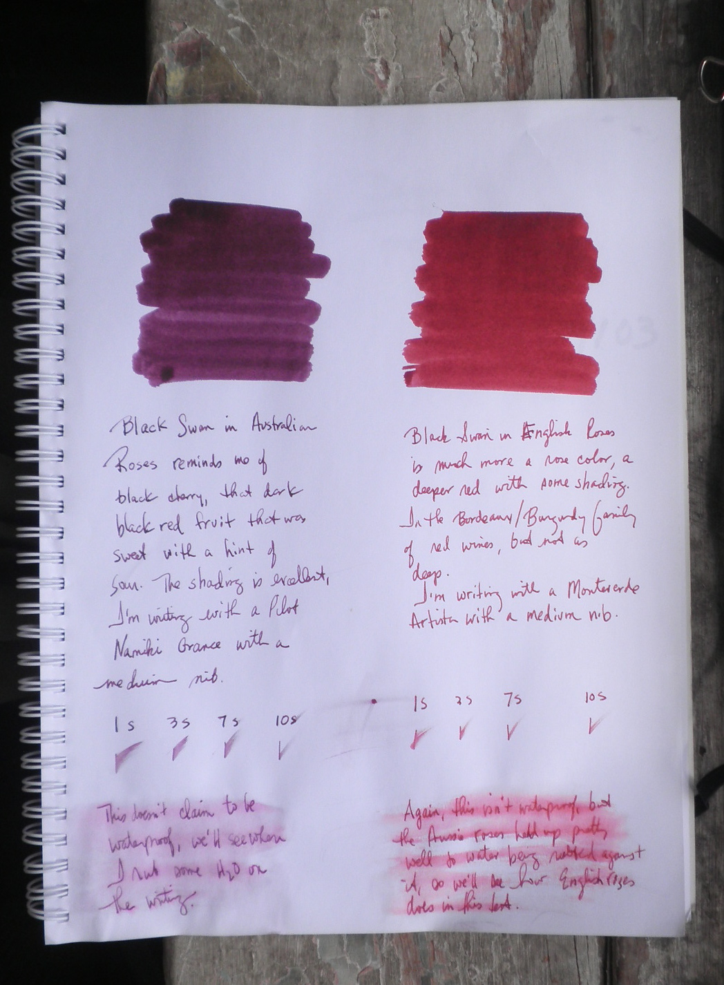
The second of the Black Swan inks is Black Swan in English Roses, which is much different from its Australian cousin (as you can see in the picture to the right that compares the two Swans).

English Roses is a deep, bright burgundy, reminding me of the wine inks of De Atramentis. It has more in common with a poppy than a rose (as Nathan Tardiff notes in his video). The ink's shading is beautiful but understated to my eye.

By contrast, Australian Roses is a black cherry color, and has a much heavier shading quality to the ink. It's a much darker color and doesn't have the brightness of English Roses.

Drying time is neither very quick nor very slow, just a regular Noodler's ink drying on the page. The paper I used isn't in the Rhodia/Clairefontaine category, but a bit better than copy paper.

The Roses inks aren't waterproof, but I was surprised at how well they held up when water was poured over them and then rubbed into the writing.

Definitely take a look at the video, the art work and explanations of the process behind the ink are always worth watching.

Friday, July 15, 2011

Platinum Mix Free Ink Review

Margana, the proprietor of An Inkophile's Blog, has posted a great review of the new Platinum Mix Free Inks. These are definitely of interest to me, and the pictures are magnificent. Definitely take a look.

Saturday, July 9, 2011

Sheaffer Skrip Blue Ink

I've come to like using Sheaffer Skrip blue ink, it's a brighter blue with quite a bit of purple in it (the above pic is a fairly good capture of the color).

Skrip is easy to find and comes in the standard array of colors (black, blue, red, green), but there is something about this blue that makes it stand out from the rest of my blues. It has a glow to it that I don't see in the J. Herbin Bleu Nuit, which is another "benchmark blue" that I use for color comparison. It also shades and covers well, with a lot more pigment than I expected.

The Skrip blue ink dries very fast, which is another plus. It isn't waterproof, but I've rarely needed that feature in any of my inks (never, actually). It's readily available, and looks good on paper (or fingers, if you slip while filling as I do). There's a lot to like in this ink, definitely give it a try.

Friday, June 24, 2011

Squeteague and Other Blue-Green Inks

Playing around with some of my more interesting inks, I thought I'd catalog the blue-green shades and see where they fit on the spectrum.

The greenest of the blue-greens is Noodler's Squeteague. In swabs it may look more blue, but this is actually a deep pine green with an undertone of blue.

Next is Iroshizuku's Syo-Ro, which is describes as a dark turquoise. It's blue with just a hint of green to it, and I have to say I was impressed by the color and wondering why I don't use it more.

The two that are most similar are De Atramentis Sherlock Holmes and Diamine Twilight, dark night sky blues with a touch of green to deepen the hue.

Finally, there is Diamine Teal. Teal looks as if it is more a 50-50 blend of blue-green than any of the others and perhaps the standard for that mix of color.

Monday, April 11, 2011

Diamine New Century Teal

Looking through Diamine inks at Art Brown, I thought I'd given this Diamine New Century Teal a tryout. The swab is next to Diamine's Twilight for contrast, and you can really see that this Teal has more green in it. Writing in a Sailor Reglus fountain pen with a fine nib, the Teal looks very green with just a hint of blue in it.

The Teal isn't waterproof, and it does take a few seconds to dry. If you're looking for a blue-green that's heavier on the green then Diamine New Century Teal is a great choice. This is really the color I was looking for when I bought Iroshizuku's Syo-Ro, which is described as dark turquoise but seems less green.

Tuesday, January 18, 2011

Limited Edition De Atramentis Inks

Art Brown is showing off five limited edition De Atramentis inks that have just arrived, only 250 of each bottle are being produced and sell for $20 for 28ml (one ounce-ouch).

From left to right: South Sea Blue, Australia Red, Tropic Green, Africa Brown, North Gray. Larger pics at the website but no swabs.

Sunday, January 2, 2011

Chesterfield Archival Vault Permanent Ink


One of the websites I visit is xFountainPens.com, a Pittsburgh-based retailer with good-quality, low-priced pens. They are the only place I've come across that has Chesterfield ink, which has gotten some positive posts over at the FountainPenNetwork (especially the browns, Sepia and Mahogany).

I recently placed an order for one of their pens and decided to try out the Chesterfield Archival Vault permanent ink, which like Diamine Registrar's Ink is said to be the exact same formula as used in the United Kingdom to record demographic data (births, deaths, marriages). Like Diamine, it starts out blue and oxidizes to black, in this case more of a dark blue black. And it is waterproof and permanent, of which I can only test the former (but will ask my heirs to blog about the latter in seventy-five to a hundred years from now, so stick around).

Diamine Registrar's Ink is an iron gall-based formula, which can damage a pen without regular cleaning. There's no mention of that on the xFountainPen website, but according to a great review by fiberdrunk at FPN the Archival Vault is made by Diamine for Chesterfield, and is the same iron gall formula as Registrar's Ink.

The two inks may be identical in most ways (waterproof, permanent, blue-to-black-oxidation) they are distinct in one particular way: color. In the picture at the top, the upper right corner compares Diamine on the left to Chesterfield on the right. The Diamine fades to black with a distinct blue-green undertone, while the Chesterfield is a truer black-blue color.

I like both inks and wouldn't recommend one over the other based on the color, but I would do so based on price and amount. The Chesterfield is 50ml for $9.99 while the Diamine is 30ml for about $15 (the glass bottle of the Registrar's Ink may make an aesthetic difference but the illustration of the horse and carriage on the Chesterfield "plastic" bottle goes a long way towards alleviating that little detail). And xFountainPens offers free shipping on orders of $15 or more, so two bottles of ink or one of the lower-priced pens will get you into that territory.

As you can see, the ink is definitely waterproof. I had it under the faucet, running my fingers over it, and there was a small amount of ink loss that tinged the paper a pale-deep blue but nothing you would really notice regarding the writing. I like this Chesterfield Archival Vault, it fits my template of what a true blue-black ink should look like. If you're interested in archival quality, waterproof ink made by Diamine for Chesterfield and sold at a reduced price, definitely give this a try.

Thursday, December 30, 2010

EVERFLO Blue Black Ink


Among the Christmas presents from my brother was this bottle of EVERFLO Blue Black Ink from Binder-Baer's Gate City Pen & Ink Co. Blue Black is one of my favorite colors, so I was a bit surprised when I swabbed this and took a closer look--it's really a very dark blue with the barest hint of black. An unusual and very deep, rich color that's somehow different from other blues I've got on hand (I'll have to swab them all for a future review).

Per the website, EVERFLO ink is "especially formulated to be benign, washable, and well behaved in all pens." It's definitely washable as the above pic shows, there's almost a water-color quality to this ink when it meets water.

Drying time is so-so, but that may be because the pen I was using (a vintage Waterman that's scheduled for review soon) has a semi-flex wet noodle of a nib. The ink creep on this nib is amazing, almost looks like a blue alloy over the gold that's how much ink gets on it. So I'll have to give this a try in another pen, but if you like dark blues give this one a try.

Monday, December 20, 2010

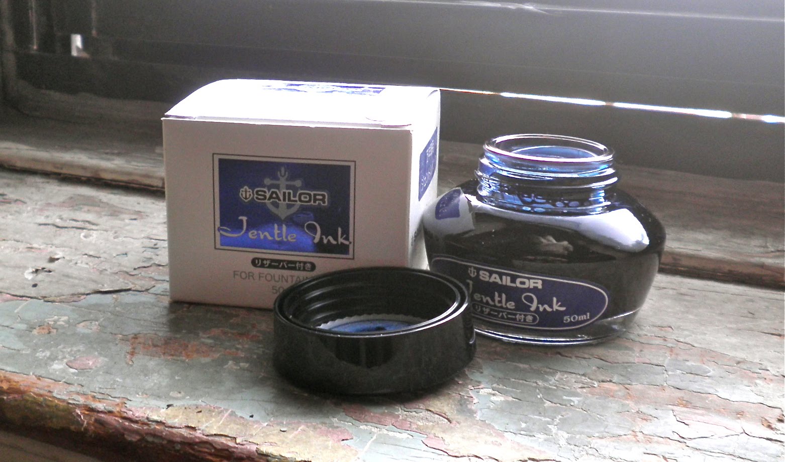
Sailor Gentle Ink in Blue Black

An ink that I discovered at the October 2010 NYC Pen Show was this Sailor Gentle Ink, and particularly this color--Blue Black. I saw it first when testing out the TWSBI Diamond 530 pen, and absolutely fell in love with the color.

The above picture doesn't really capture the color of this ink, which looks like it's blue with a black tinge to it (and so it should be "black blue" indicating that it's a blue color with black characteristics). While not waterproof, the ink did hold up pretty well when H2O was added. And while not a quick drying ink, it wasn't as wet as some and dried within a fairly short time.

I do like how this shades, very dark with blue highlights. It's a lovely color, and looks great in clear demonstrators like the TWSBI.

Friday, December 10, 2010

Everflow Orchid Ink


Gate City Pen and Ink Company is an informal partnership between Richard Binder and Jim Baer offering vintage-style fountain pen and inks from days gone by. The Everflo Orchid ink caught my eye at Goulet Pens, an interesting color reminiscent of Waterman's purple ink.

Definitely smooth flowing, the ink color is very similar to J. Herbin's Violet Pensee--a purple that is touch on the blue side but not too much. Not the fastest drying ink and not waterproof either, it's a nice, clear color with a hint of shading to it.

The above had to be one of the hardest pictures to take and I'm still not happy with the ink color (haven't done any retouching at all). The ink itself looks more purple on the page, while this pic makes it look too blue. But then I look at it on the paper and it does seem more blue and less purple. Frustrating!

Tuesday, November 16, 2010

A Pair of Pelikans

I was looking at several inks at the NYC Pen Show and saw the Pelikan 4001, which I later purchased in Blue-Black to try out with my Monteverde Invincia Color Fusion.

The two did not get along, but I wanted to see how the 4001 ink ($9.75) worked in another pen and decided to try it in a Pelikan, the M205 Clear Yellow highlighter that I bought with an extra fine nib.

Then I decided to see if next to the Pelikan Edelstein in Topaz ($20), and decided to use my Pelikan M205 Clear Blue with a fine nib, just for the symmetry.

Both inks have their attractions, the 4001 is a dark blue with black shading in it. I like the color, it's a good, everyday ink. The Edelstein Topaz is bright blue, and also shades very nicely. I'm thinking J. Herbin Bleu Pervanche might be very similar to this ink, at least on the monitor.

Both inks are a nice edition to my line up. I'll be very interested to see if any other pens aren't fond of the 4001, or if it's a Monteverde quirk.

Thursday, September 30, 2010

Pelikan M205 Duo Yellow Highlighter Ink


My Pelikan M205 yellow duo arrived a few days ago, and I wanted to play with the highlighter ink but didn't want to use the M205 pen. As I happened to have a Preppy highlighter available I made an eyedropper out of it and started highlighting.

This ink has an amazing green neon tinge to it, which you can see a bit of in the bottle in the above picture. There wasn't any feathering or bleed through (the journal is an Ecosystem with bright white paper), although the felt tip of the highlighter picked up some of the ballpen ink (which always happens).

This is just a fantastic neon yellow color, and you can purchase it at Goulet Pens (and other places I'm sure) separate from the pen itself. I don't use highlighters much these days, but I'm planning on using this one as it's just so bright and clear. If you make your own highlighters this might be an option to check out. I filled my Preppy about 2/3rds full but the 30ml bottle hardly seemed to have been used. So I'm thinking this will last a very long time with many, many highlighters filled.

Tuesday, September 28, 2010

Pelikan Edelstein Mandarin Ink


This is Mandarin, a clear true orange with just the slightest tinge of yellow, but that may be only when compared to another orange such as the Diamine Pumpkin. I'm not familiar with that many orange inks, but I think this might make an interesting highlighter if you wanted to dump the yellow and try this in a Preppy eyedropper (maybe with a drop or two of White of the Whale).


As you can see from the picture, this ink is not waterproof. There is no noticeable shading to Mandarin, and the ink didn't make my Muji steel fountain pen into a wet noodle. The pen's fine nib remained dry, no nib creep, and worked continuously--no dry starts or skipping, no shaking the pen to try and force ink into the capillary/feed. It's a well behaved ink, and there was no feathering on the paper and no bleed through on the Franklin Covey notepad, so this seems like a good choice for double-sided writing.

I wouldn't call this fast drying, while I didn't do a test of the Mandarin I have tested the Topaz and Jade and it's neither slow nor fast. It's definitely a fun color, not as serious as black, as soft as blue, nor as bold as red. If you're into orange inks or just want a change, give this one a try.

On the top right, courtesy of The New York Times, is a recent pic from the Milan fashion shows that actually does a good job of explaining Mandarin and Pumpkin. The Edelstein Mandarin ink is the color of the skirt, the Diamine Pumpkin is the top; jacket and model not included.

Saturday, September 25, 2010

Pelikan Edelstein Ink -- Jade


The one color among the much-anticipated Pelikan Edelstein inks that I very much wanted was Jade, which looked to me from the various pictures to be a soft yellow-tinged green that was different yet acceptable in polite company. I was thrilled to find that the color lived up to my expectations, it's a beautitful soft green with distinctly yellow overtones.


Jade is a very well-behaved ink, so polite and gentle you almost forget it's there. No ink creep on the nib, no skipping, flows very well, and while it almost made my Lamy Al-Star EF into a very wet writer the ink flow never quite reached that point. Just a bit wet, but not too much that it became annoying and messy. Drying time was average, neither incredibly short or long.


But the color is the main attraction for me. Jade is as close to a darker, more visible version of J. Herbin's Diabolo Menthe as I've seen; the latter is a touch more blue, but for me it's way too pale to use as an everyday writing ink. The above picture shows the two colors side by side, as well as the bottles. Jade is quite to my liking, and will definitely get a lot of play in my fountain pen rotation.


Finally, the bottle is a tie with Pilot Namiki's Iroshizuku as being one of the most elegant designs in glass. The picture above compares Edelstein's Jade on the right with J. Herbin's Diabolo Menthe on the left, showing off the Edelstein bottle's rectangular shape and larger bottle mouth. All four sides of the rectangle are slightly concave and give a nice, tapering look and feel to the thick glass, while the printing raised--also giving the bottle a distinctive feel and look.

The Edelstein Jade ink is a very pleasant surprise, with nothing usual or boring about either the color or the marketing design. I'm looking forward to trying the other colors I purchased, Topaz (a deep blue) and Mandarin (clear orange).

Tuesday, September 21, 2010

De Atramentis Sir Arthur Conan Doyle Ink


Another De Atramentis Historic Persons ink I recently purchased, as a companion to the Sherlock Holmes Night Blue ink, was this bottle of Sir Arthur Ignatius Conan Doyle. The color is Oriental Red, which should be reddish orange but looks too dark and with a slighrtly blue tinge to it.

I've included the above photo of some of my reds to show where it it on the red ink scale. The photo to the left hasn't been enhanced, but in that pic it looks more like red-orange than the above. Perhaps a difference in paper (Rhodia vs. copy paper) or light or...whatever.

There's no obvious tie in between Arthur Conan Doyle and the Oriental Red color De Atramentis chose for his ink, just as Sherlock Holmes and Night Blue ink also have no particular connection. The color is not bright like the Diamine Poppy, and I think of it as being a good editor's red, something I could see marking up a handwritten page of fiction dealing with ratiocination and hell hounds.

Like the Sherlock Holmes, the ink isn't particularly quick drying. It flows well from my Platinum Affection fine point fountain pen, and there was no bleed through on the paper (copy paper in a very pretty notebook). It's a muddy red more like claret that hasn't been decanted--something Conan Doyle and Holmes would have seen as a clue to the time of Lord Something-or-Other's death, perhaps (after the cheese tray but before the butler could do it).

Reds are hard to describe, harder to use and not make it seem as if you're critiquing something or someone. To me they're more personal, a Greek chorus in a bottle warning of lemurs. A great addition to your red collection, if you're looking for something a bit different.

Friday, September 17, 2010

De Atramentis Sherlock Holmes Ink

One of the De Atramentis Historic Persons Inks is Sherlock Holmes, which along with their Sir Arthur Conan Doyle ink commemorated Doyle's 150th birthday (May 22, 1859). These inks just got to the US, and I've been to Art Brown International Pen Shop several times looking for a bottle only to find the slot empty. Third time's the charm, and on my last visit I finally found Sherlock on the shelf, one bottle in the slot and none to replace it for a few more weeks.

The color is called Night Blue, and it does seem like a dark but not stormy night sky. To me it looks like there's some turquoise in this (the picture is true to the color, no special effects added), but I'm not totally sure. What's nice about this ink is the smooth flow, no skipping or dry starts where you fear for the nib tip because you're pressing so hard trying to get ink to flow out. What makes this a lot of fun is the bottle (use the link above), which has a silhouette of Sherlock Holmes in deerstalker and pipe rather than a portrait like the other Historic Persons inks. Because each of us has our own perfect Holmes in mind, but the character is universal rather than specific--like night blue sky, I imagine.

There's a bit of shading to this color, though not much, and drying time is good although not a quick dry ink. The Platinum Affection I used has a fine nib, and the paper is some regular copy paper from a new notebook that I recently bought because I loved the cover. There was no bleed through, but not for lack of trying on the ink's part.

Definitely a beautiful and different blue, one that I'm looking forward to using a lot.