Showing posts with label Diamine. Show all posts

Monday, April 11, 2011

Diamine New Century Teal

Looking through Diamine inks at Art Brown, I thought I'd given this Diamine New Century Teal a tryout. The swab is next to Diamine's Twilight for contrast, and you can really see that this Teal has more green in it. Writing in a Sailor Reglus fountain pen with a fine nib, the Teal looks very green with just a hint of blue in it.

The Teal isn't waterproof, and it does take a few seconds to dry. If you're looking for a blue-green that's heavier on the green then Diamine New Century Teal is a great choice. This is really the color I was looking for when I bought Iroshizuku's Syo-Ro, which is described as dark turquoise but seems less green.

Tuesday, November 30, 2010

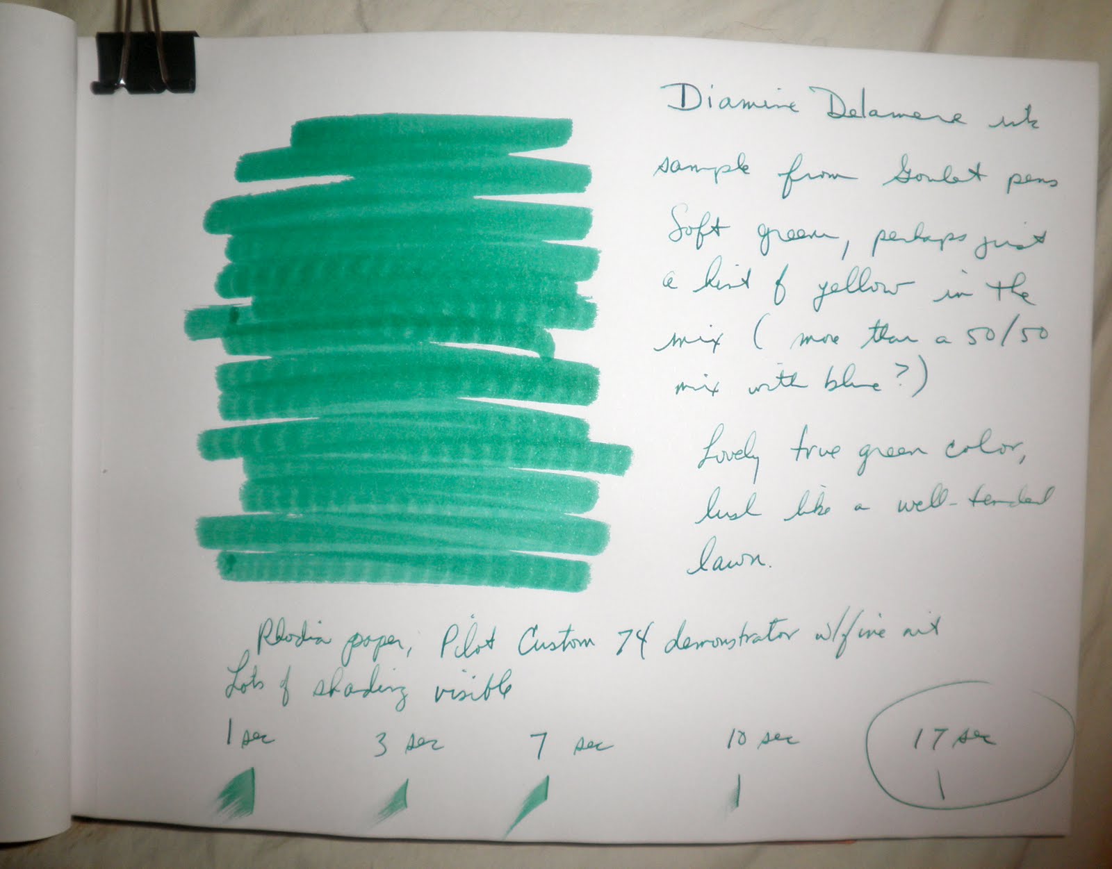
Diamine Delamere Ink

My Noodler's V-Mail GI Green was a bit too wet for my pen, and wound up getting into parts of the pen where I couldn't remove the ink. So I was looking for a more well-behaved green, and decided to give the Diamine Delamere a try as a sample from the Goulet Pen Company.

This is a really beautiful green, true to the concept of green with maybe a touch more yellow in the shading. It's not the quickest drying ink, but it doesn't take forever like some. I tried it out on a Rhodia 80gsm notepad using my Pilot Custom 74 with a fine point. If you're looking for a deep green, try the Diamine Delamere.

Friday, September 24, 2010

Diamine Twilight Ink


One of the new Diamine inks I really wanted to see was Twilight, a deep blue with just a hint of black in it that looked great in The Goulet Pen Company's pre-release swatches. The twilight time is a favorite of mine, so this became a must purchase. And as I had my De Atrementis Sherlock Holmes at hand, I decided to compare them.

First, the Diamine Twilight is a well-behaved ink. No skipping or nib creep, great saturation on the paper, and the drying time is okay. The color is rich and dark, and it's a great addition to your lineup. I used a Cross Century II fountain pen with an extra fine nib to try the Twilight, and was surprised at how dark the line was and how smoothly it flowed through the pen.

What I hadn't been expecting was how close it was to Sherlock Holmes, which is also a deep night blue color. The Diamine tends towards black while the De Atramentis has a touch more green in it, but at first glance they were hard to tell apart. Oxidation led to the Twilight looking a bit darker than the Sherlock, but I'm inclined to say that if you have one you might not need the other.

Thursday, September 16, 2010

Diamine Syrah

Came back from Art brown with several new inks, including Diamine's new Syrah. This is a really beautiful burgundy/maroon, with enough blue in it to make it stand out amongst the red colors as different.

All my pens seem to love Diamine ink, and Syrah is no exception. My Pelikan's medium nib got a touch of ink creep, but the pen itself was amazingly wet--absolutely no problem with ink flow on the first letter of a sentence, as I've had with pens using Noodler's.

Syrah shades nicely, giving a very deep color where the ink pools a tad. It dries...eventually, lol. It's not a quick drying ink, and as I couldn't find my Rhodia pad for this I wound up using a regular blank notebook with standard paper. The ink didn't quite bleed through, but that may have more to do with my fanning the page and cursing rather than the paper quality. Definitely a true burgundy and not too red or too blue/purple.

Thursday, July 8, 2010

Diamine Registrar's Ink


I love dark blue-black inks, and had seen previous reviews of the Diamine Registrar's Ink. This small, 1 ounce (30ml) bottle has an almost antique look to it, so I was keen on trying it. I'd read that it was based on iron gall ink, which can damage modern fountain pens, so I was a bit hesitant. But on further reading over at FPN it seems that as long as I give my pen a good soak all should be well.

The ink starts out a dark blue with black in it, then oxidizes to black. According to Diamine, this is permanent and waterproof ink to be used for maintaining official records. (I don't think my journal counts as that, even if it is a large orange Rhodia webbie.)

The color is velevety soft, like the night sky. Next to it Swisher Blue Black looks like it has a teal undertone. I wanted to see it against a truer blue, so I swabbed the J. Herbin Bleu Nuit for comparison. I like this old-looking color, and plan on using it for a lot of my notes and writing.