This just came in the mail from Tom Oddo of Goldspot Pens and Oddo Ink, one of the best ideas I've seen for fountain pen lovers: the InkJournal, a pocket-sized notebook to record pen and ink combinations, as well as space for a color swab and a comments section.
Inside front and Index
I've kept track of my pen/ink combinations
in a small notebook which eventually I misplaced. This is more
detailed than I used before, and I like Tom's idea of giving fountain
pen lovers their own specialized journal.
The first two pages of the InkJournal are an index with page numbers, so you can find each pen and ink
combination easily.
Second index page and first ink/pen page
The journal is made from 100% recycled papers,
printed with vegetable-based inks, and the cover is a very stiff 18 pt
chipboard. The interior pages are 70# text weight, and fountain pens do
work well on the paper.
Second ink/pen page
There's a lot of of room to show off your pen/ink combinations, with all the necessary
information you'll need (date, dry time), while the second page is blank
for notes or additional comments. There was some bleed through with this ink, an Everflo I think, but it wasn't too bad and didn't detract from the overall great paper.
The 3.5" x 5" InkJournal allows you to catalog 15 pen/ink
records, so you have 45 combinations you can keep track of for future
reference. The InkJournal's front cover is a drawing of a 14k nib being dipped into an ink
bottle, while the inside page designs are elegant and spare.
front of the blotter card
Each 3-pack of journals includes an
instructional blotter card explaining some basic ink terminology
(shading, saturation, flow). The card is thick and can be placed behind
the page you are writing on, giving a firmer writing surface while also
preventing any ink bleed through.
Back of the blotter card
And since it's unfinished matte paper the card makes a great blotter, although it's so nicely done I'd hate to ruin it.
Besides using this for fountain pens, I don't see why you can't record your favorite gel inks or other pens. It's a great way to see the way a pen writes or to note a particular color. I'd use it to test out various blue/black gel ink pens, to see how closely they match.
Do check out the Facebook page, where you're invited to post scans of your pen and ink pages. That would be a lot of fun to see, and I hope Tom gets a lot of photos on his page. If you want a new journal dedicated to keeping your pen and ink combinations in elegant order, the InkJournal is something you want to add to your notebook collection.
Cavallini & Co. is one of the premier gift and stationery companies in the US, founded in 1989 and based in California. The notebooks and calendars (and other items) use old images to create modern stationery that just seems like it came from someone's attic or a time capsule. One of my favorite notebooks is this, a popular slogan these days but originally from World War I.
I recently picked up Cavallini's Flora & Fauna mini journals, a set of three pocket notebooks measuring 4" by 5.5" and decorated with beautiful vintage images of birds, flowers, butterflies, deer, and what looks like written pages from an old ledger. The covers are made from a very thick, sturdy, and smooth paper stock that definitely feels like it won't wear out too fast or fray/tear while bumping along in my handbag next to my 20lbs of lifestyle necessities. And the colors are striking, rich but not gaudy.
The notebooks have 96 pages and you get one black, one line, and one graph on cream colored stock that feels like it's about 70gsm to 80gsm. I haven't tried writing yet, as I'm already using several other journals, but I would guess that these are in the Moleskine category: not especially fountain pen friendly, with a touch of shadow using gel ink pens. Definitely check these out, I found them in a small stationery store on the Upper West Side but Cavallini is also available at Barnes & Noble, Anthropoligie, Dick Blick, and other online and bricks and mortar shops.
These are from a small accessories shop nearby that mostly carries jewelry and notecards, but near the front were these two journals from Millimeter Milligram of Korea.
The smaller gray is a 7 space notebook measuring 4.75 by 7 inches. Half the page is blank, the other half has 7 nicely-space (6mm) lines so you can write and draw on each page to your heart's content. The bright red lines really stand out on the cream colored paper, which is heavy (about 80gsm) and very smooth--a bit like vellum.
The larger brown notebook 5.75 by almost 8.25 inches, with a medium-weight cardboard stock for the cover and slightly thinner cream notepaper. Again, the bright green lines look great on the deep cream paper, an all around pleasing combination. I haven't tried either notebook yet, so I can't say how they will hold up against different inks. My guess is that they'll be okay, not necessarily in the Rhodia-great category but certainly not newsprint-flimsy either.
Where to buy? Online you can find MMMG products at Poketo, the overseas distributor for the US and Canada. I've also read Kinokuniya may stock these, so if you have a store near you they may carry some of the notebooks.
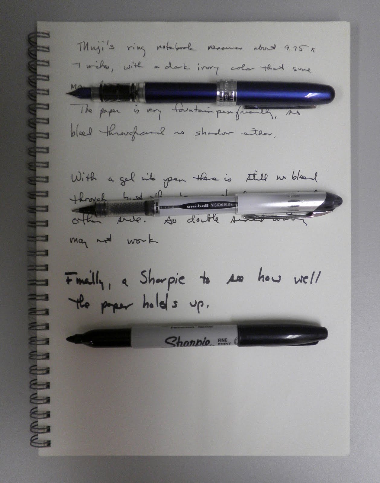
I am not fond of double ring notebooks, as I've had problems in the past with the end rings separating and catching on my clothes or other things. But this Muji beige double ring notebookcaught my eye for its unusual shape: 6.9 by 9.8 inches. It's a hard cover as well, so notetaking using my knees as a desk top works out okay.
The blank paper also made an impression: the pictures don't capture the color, but it's a very deep ivory with a lot of weight to it that I don't expect in recycled paper. It's also got a very smooth surface, making writing a pleasure.
The paper (80 sheets, by the way) is also fountain pen friendly, and does pretty well with gel ink pens. The ultimate test is a Sharpie fine point, and there the paper couldn't keep back the bleed through. But the paper did absorb the ink quite well, so there was not dotting or ghost writing on the following page.
All in all, a good notebook and something I'm going to enjoy using. But I will have to stop by one of the NYC stores and check out this recycled dot notebook, which comes in an A6 pocket size.
Reading this post over at Dave's Mechanical Pencils had me wondering where I could find Pantone Universe supplies like this, particularly a notebook. When I went online to Pantone I couldn't find any information about notebooks, much less mechanical pencils, so I figured I was out of luck.
Then I noticed these really interesting notebooks tucked away in a corner at Kinokuniya, and discovered this one, a Pantone Universe notebook in Flame Orange (15-1157TCX in Pantone Code). According to Pantone this color is jucy, exotic, and friendly, all of which I would agree with, along with bright and lively.
You can't see it in the first picture above, but on the right side are the words Pantone Universe glazed into place against the matte orange cover. The back, pictured above, gives you the color code information.
The Pantone Universe notebook is made in Japan, an interesting 7in. X 10in with 100 pages of bright white paper. I like the white double rings next to the bright orange color, the combination reminds me of a vibrant creamsicle.
The paper itself is quite good. It's not especially fountain pen friendly, and as you can see there is some bleed through on the top writings. Gel inks work well, especially the Zebra Eco Clip I used in the last sentence.
What was equally of interest was the price: $7.95 for the notebook, which is quite reasonable for a specialty product like this. Given that Kinokuniya's pricing system is a bit idiosyncratic (paper products tend to be cheaper than at JetPens, but pens and other writing instruments tend to be a lot more expensive--given it's a brick and mortar store I would have expected both to be higher, not just the latter), I'm not sure if that's within the expected range or not.
If you can find any of these (or can point me towards a source), do give them a try. The cover colors alone are worth it. I am certainly thinking of getting one of these, not because it's better but it's certainly cooler than the ones I already own.
Muji carries some very nice notebooks in its stationery lineup, including this pocket notebook with dark ivory paper and a red cloth page marker. The dark tan paper cover is fairly heavy but the notebook itself is flexible rather than hard. The 5.75 by 3.75 size makes it ideal for pockets or purses, although the 144 pages means it is very thick (about a half inch or more) and therefore could be unwieldy.
The paper is a bit darker than shown in the picture above, and not very fountain pen friendly (some bleed through). Gel inks and ballpoints work well on this very smooth recycled paper so if you just need to jot notes or make some quick sketches this is the right paper for you. Unfortunately the notebook isn't available online, but if you're around a store take a look at this pocket notebook.
One of the more interesting purchases from Sustainable NYC was this Michael Roger cork notebook. It's a pocket hardbound notebook measuring 3.5x5.5 with lined cream-colored paper that's rough to the touch but works pretty well with an assortment of pens.
The journal cover is made from sustainably-harvested cork (stripping the outermost layer of bark from the cork oak tree, which then grows back and can be re-harvested). There's an elastic band for closure, but no pouch at the back (which I find refreshing, actually). It's certainly different from small Moleskine, Ecosystem, and Rhodia webbies, and if you have several small pocket journals around you'll find this one right away by touch or sight. I'd probably go with a tan or dark brown elastic band, as I find this white one a bit out of place, but that's really my only negative for this small pocket notebook (and the price of $10.95 is right in line with other pocket notebooks as well).
The small pocket journal has 160 narrow-lined pages (there's a blank journal one as well), but I didn't find them too narrow that I couldn't write. In fact, I was rather impressed by this little journal. The paper is quite writeable with no ink creep on the letters or smearing. And except for the Sharpie permanent marker, none of the inks bled through the pages.
According to their website, Michael Roger Press is a small bookbinding firm in New Jersey, and they manufacture almost everything by hand at their warehouse. There are some very nice small and medium-sized journals available, along with other odds and ends that are in the "buy it and then find a use for it" category. I do like that Dispatches Journal, and will have to look around for it or place an order.
When I first saw the Rhodia Reverse Book, I couldn't figure it out. Obviously you could use it differently than a standard grid notebook, either with the ring binder to the left or at the top and that would effect the way you took notes. But that didn't seem like much to me, so I basically used it as a left-sided-ring notebook.
But I realized I was missing something by not trying it out as both a left= and top-sided-ring notebook, and started playing around. The side nearest the cappuccino (my own personal North Star) is written as with the ring on the left, the bottom side with the ring on the top (I had to blur the writing).
Good, but I wasn't really rushing to use the Reverse Book as anything but a traditional notebook, usually with the ring on the left. I was constantly turning pages back trying to find my notes, and getting frustrated.
Then one day I figured out how to use this to the best of its (and my) ability: when the ring binder is at the top, life up the page you would be writing on and start on the back of that page at the top first, writing down the full page. Then turn the page over and start on that page as your second page, again starting from the top.
What I found is that I could read my notes quickly and more easily by having the pages turn in a specific way, which just seemed to help me find what I needed more quickly. Weird, huh? But with that one little quirk, the Rhodia Reverse Book has now become my favorite notebook for all my current work projects.
I do like the paper, obviously, and the violet-colored grid design is great. I would like to see a blank Reverse Book, as the grid lines sometimes interfere with looking at the words. If you have one but are frustrated like I was, take a moment to go over the Book's layout and figure out the best way to use it. It's really worth the extra effort.
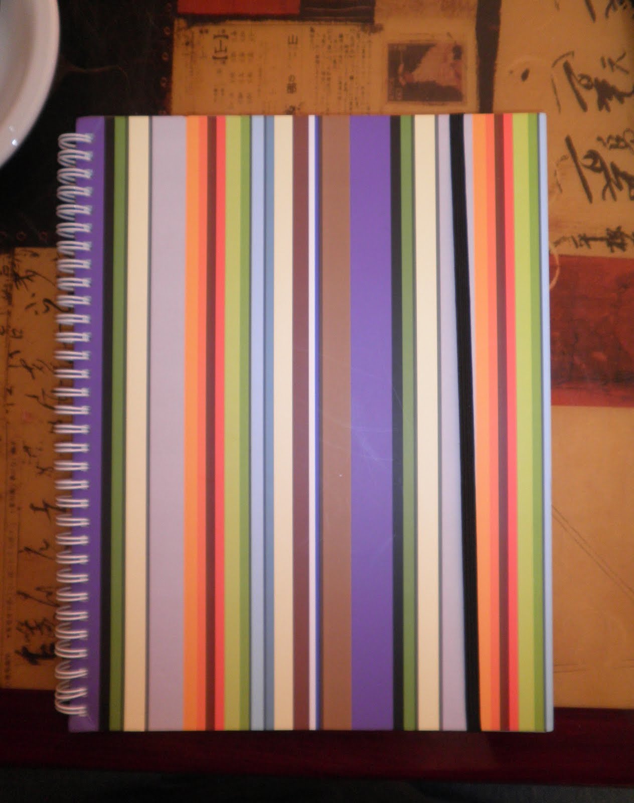
Passing through Grand Central Terminal a few weeks back I stopped by Papyrus, which has several locations in NYC that I've been to but not the tiny postage-stamp of a store in GCT. I was really taken with the large, brightly-colored wire-bound notebook with a black elastic band.
The striped notebook, called Festive Stripe, is a standard 8.5 by 11 inch size with 120 sheets of paper and sells for $8.95. It's part of the Papyrus store's own line of stationery products, which are numerous and include some very nice leather journals as well as cloth-bound notebooks of all sizes. The Papyrus and Carlton Cards retail stores, with 450 locations in the US and Canada, are owned by Schurman Retail Group.
Schurman, founded in 1950, offers premier stationery and "social expression" items, including the notebook pictured above, stationery, cards, journals, and lots of other interesting things that are great impulse buys when you're killing time in a train station. I like the bold striped colors, as well as the way the black elastic band fades into the cover. But how good is it as a notebook is a better question.
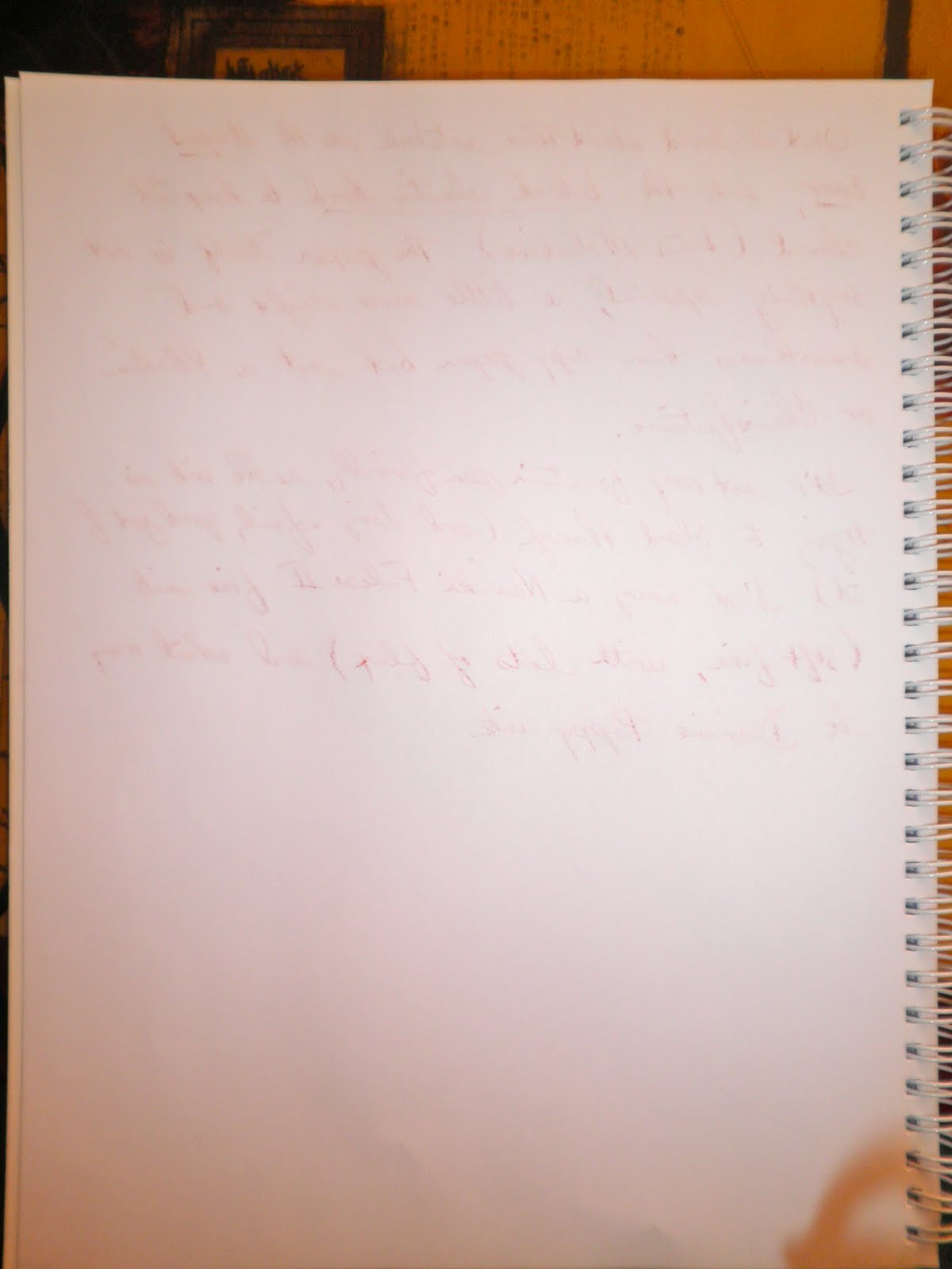
There were two sizes offered, one more of an A5 similar to a Rhodia large Webbie and this letter size notebook. The paper is better than printer or copy paper, definitely smoother and more substantial. But definitely not in the same 80gsm to 90gsm as Rhodia or Clairefontaine. Meaning this isn't fountain pen friendly, no matter how fantastic unlined bright white paper may be for different fountain pen ink colors.
One point to note is the black elastic band. The bank is held in place by brass-colored metal grommets attached to the back cover. A small paper tab is glued over the elastic to keep it in place and to make sure it doesn't show through on the inside of the cover.
Both are very nice details that do add a touch of thoughtfulness to this notebook (not that it was slapped together in some mass-market factory, but actually designed and manufactured with care).
If there's a Papyrus in your area, do stop by and check out their line of notebooks and journals. The price is not too high, and they're definitely fashionable and pretty well-made.
Chuck sent me this email about how he custom designed his own perfect notebook, and he agreed to let me post it on Pocket Blonde. The time and dedication spent in creating this beautiful leather flip top notebook holder and notebooks made me feel both awed and envious. Enjoy the post, as I did.
Notebooks, for me, mean a lot of different things. As a kid, I think I was attracted to them for organizational reasons as well as convenience. Not that I could articulate it, but turning in homework and taking notes always seemed a little silly on huge sheets of paper. I often don't jot down much about what I need to recall, but the amount I do take down really always seemed to be better organized on smaller sheets. Then there's the convenience factor of not having 8 x 10 sheets that have to go in binders or bags.
My basic model is that the easier it is to take notes, the more likely you are to take good notes. Also, if you know that writing important things down once will allow you easy access to that information for the future, it “boosts” the incentive to write it down in the first place. The ability for the notebook to blend into your wardrobe so that you don’t have to hold it when you need your hands free, or are always leaving it on your desk or in your car, is critical. Taking notes should almost appear seamless, or least not a huge distraction. So to sum up convenience, it’s got to small and light enough to carry, but large enough to allow for room to have some form of organization and of course should include the all important writing implement.
Then there’s archiving. What good are notes you can’t locate? That’s where the Moleskines stumped me. I get that if you’re going to Greece and you want to scrapbook your experience, they may work well and look very elegant and sophisticated in the coffee shop or on your bookshelf. What, however, of the day to day? Projects, lists, phone numbers, addresses--all of these things have multiple recall uses.
Sometimes, I take down information that I don’t even know I’ll need later, but I’ve still got it. That’s where my note taking mantra really shines. Without inserts though, that display date ranges and important note content, I’d never be able to recall seemingly random records. The beauty of my little system is that my book looks every bit as elegant as the Moleskines, except I can remove and label the inserts and I fill them up. This allows my books a great deal of flexibility. I imagine that with Moleskines, you might hesitate to put “off topic” issues on your pages. That recipe or cute boys’ phone number would be difficult to locate on a random page of a book you used for journaling or traveling, and have now closed out.
There’s also the sexy factor. Growing up with a passion for the New York original Law & Order, the power and influence of the notebook was unmistakable. All cop dramas and news/media shows draw from the image of the concerned and altruistic investigator cobbling together seemingly random bits of information held together by little more than the spiral bindings their notebooks.
Notebooks show that you’re both caring and responsible. They indicate that you are prepared to personalize the concerns of others and have a real shot and getting the details of certain situation right. The ubiquitous “loose cannon” detective with his big gun and leather jacket, always scribbling notes in his notebook… or brashly flipping it open (always to the correct page) to prove the accuracy of something he’s talking about. This is another reason I wanted something in leather and w/ a pen loop. With a bit of practice, I could whip out the book, the pen and start writing all in one smooth motion; sitting, standing, walking, whatever.
So those are some of my visualizations. In reality, I’ve bumped around careers in journalism (early on) and real estate. Good notes, of course, are key to success in either field. My notebook makes conducting background checks in the court house a pretty cool endeavor. Investigating target properties, tracking their ownership through the recorder of deeds… these are all perfect notebook applications. In this capacity, the books are like a clearing house that stores all the bad or useless info, until you find what you’re looking for and proceed to the next phase of the project.
I guess the last thing I’ll talk about are the various blogs. Firstly, they help you feel like you’re not the freak you think you might be when you realize you’re not alone. You’ll notice I haven’t really touched on pens or paper quality, cause for me those things don’t matter as much. A smooth writing, well weighted pen isn’t lost on me, but nibs and inks are probably a little far afield. The importance of keeping the book though… well let’s just say we’re all on the same page with that one. I feel that it’s interesting that I still desire to share with people though, because I’ve found what I consider a near perfect solution to my notebook woes. I realize that an inherent issue with blogging is that it does little good to discuss items that people can’t readily go purchase at a store. I spent years researching the notebook that I designed, though you’d never know it by looking at it, and I want to share my insights, but in truth, it would be prohibitively expensive and impractical for people to do what I did. I think this is what you wanted to talk about.
I designed this book because no other notebook combines size, convenience and style in the way that I needed. I began by designing the leather cover. This cover had to be small enough to fit in the back pocket of jeans and the inside pocket of jackets, but large enough to hold a book capable of organizing concepts and information that may not be collected “linearly” (often when you talk to people, they make errors or omissions in what they say, and I’ve learned that you need to leave space by skipping lines, so that you can include what they left out at a later time). The cover was also to have a pen loop and receipt flap, but those were easier to add and came only after we new the size of the cover was exactly right.
So I went to a leather guy. I’ll admit creating the notebook wasn’t his favorite activity. He did, however, really help me pick out the best leather, and show me the mechanics of putting it together. The case is two very thin, rectangular pieces of leather stitched back to back, and then simply folded in the middle to create the flip. The first time we tried it, the measurements were too big and it didn’t really fit in the jeans so well. He was nice enough to cut the cover down again, and it fit perfect with just enough sticking out of the pocket to grab it easily. The stitching looks like real craftsman’s quality, and the leather itself just gets softer with use. It’s pretty amazing. Other than that, we added two strips on the inside of the back of the book to hold the cardboard flaps of the not yet created inserts, and added the pen loop (just a strip of elastic in a loop) and a thin piece of leather on the top flap to hold receipts and loose paper.
The only challenge after that was locating a company that could produce inserts exactly the right size (3 7/16" by 6") to fit the cover. I found such a company in Florida, that could generate a spiral bound flip top notebook exactly in bulk. They did send a mock up for free, without which I’m not sure I could have committed the $400 they eventually wanted for the whole job. The mock up obviously let me see how the book would fit and feel in its case. How big the spirals would be, how much of an overhang the edge of the cover would have over the insert, questions I needed to answer before committing a ton of money. I did have minor adjustments such as the number of pages per book, and I was happier with this one and felt prepared to proceed.
The next step was the graphics of the book. Lucky for me I was looking for something very simple here--just a title line on the top with date slashes, and as many smaller lines as could fit on the page. The front covers of the inserts are similar, but they include a box for the volume number, date range and about ten lines for key topics that the insert will be filled with. The tough part was paying the $400 for the bulk amount, but by my calculations, I’m good on notebooks for 8 years now and that’s a lot better than 8 years worth of Moleskines I couldn’t use. So I bit the bullet and a VCR-sized box arrived a short time later with 100 books that were pretty perfect.
All told, after years of research and complaining about other notebooks, plus $50 to the leather guy (and buying a few of his wears) $400 for the books and I’m a happy camper. Convincing yourself that it’s worth the time before you do it--that was the toughest part.
While visiting a friend in Brooklyn I stopped by Annie's Blue Ribbon General Store to check out the Field Notes Brand stock (got the last NY State Fair three-pack!), the Moleskines, and anything new. What caught my eye immediately was this beautiful Cyan Blue Maker's Notebook, a 150 page hard-cover journal created by the people at Make Magazine.
The engineering graph paper is great for diagrams, calculations, notes, doodles, or whatever you want to record, and the notebook includes 20 pages of reference material for electronics, conversions, caffeine comparison charts, and other equally vital information.
You can also label the spine, which has a large white rectangular space for dates, thoughts, numbers, whatever.
The white grid on the cover and the red elastic band and ribbon marker make this a tri-color delight of a notebook. The Maker's Notebook is $19.95 so it's comparable to a Moleskine or Rhodia Webbie; the notebook does lie flat, and it's much bigger than other large notebooks, measuring 6.25 x 9.25 x 0.50.
The pages are numbered, and each page has a blank heading that lists the project name, date, sign or note, and a place to link project/related pages ("From Page___, to Page___). There's also a two-page ruled Table of Contents.
Definitely check out the comments at the website, the second one in particular has a short list of errors in various drawings (such as page 161, the Basic DMM Circuit Tests, which is above)).
The notebook also features a back pocket, like a Moleskine, as well as two sheets of stickers with such lines as "If You Can't Open It, You Don't Own It" and "Harmless Science Project" to paste where you see fit. My favorite is "Need Sanity Check" and I might have that blown up into a poster.
Within the realm of stationery and stationers there are certain names that can send me into a blissful reverie, imagining their founding when candelabras and gas lighting, horse-drawn cabs, coal engines and steamship were the order of the day: Crane's Stationery, Smythson of Bond Street, the recession-victim Mrs. John L. Strong formerly of Madison Avenue, and Lett's of London.
Lett's was founded in 1796 by John Lett, a stationer who set up shot within the confine's of London's Royal Exchange (one of the most pressing needs for paper was within the financial sector). Their commercial and personal journals and notebooks are of exceptional quality and style.
One particularly attractive Letts notebook is the Rush Notebook, a pocket size A6 (5 7/8" by 4 1/8") 100% recyclable paper notebook with a soft-bound cover that has an incredible basket-weave textured imprint. The paper itself has a slightly grayish tinge, and looks like the handmade paper you'd see at Kate's Paperie with the specks of color in it. The lines are a pale green, coordinated to match the paper, all of which gives this little notebook a pleasing appearance and design.
There are four covers available: grass, sun, earth, and sand, and all are beautiful. So much so that I was grateful that Paper Presentation, where I found these, only had Sun and Sand available for purchase! That was really the draw for me: the basket weave texture on the cover is beautiful, and the colors they chose for their nature tones are also my favorites. I like the large "Notes" script and the recycle icon as well, not too obvious or large to be obtrusive. The paper is smooth and soft, not what I would expect from recycled. And it is somewhat fountain pen friendly--the Diamine Poppy Red ink didn't bleed through the paper, although the Noodler's V-Mail GI Green did show through a little. In the above left pic you can see my two fountain pen scribbles, and they are matched in the right pic--the GI Green doesn't bleed through all that much, but it is noticeable. Not as bad as a Sharpie I would imagine, but enough to make me re-think my choices and use lighter inks.
The Rush Notebook is a soft-bound cover, and after some pressing it did lay almost flat (something I've really noticed once I tried Rhodia's new webbie). With 160 pages you've got a lot of paper to write on, so if you're a ballpoint, gel ink, or pencil person who likes to write a lot of notes I'd say this is a good choice of journal for you.
I've gotten to like the Rhodia Reverse Book, a square-shaped (8.25 x 8.25) notebook with graph paper that can be opened in either portrait or landscape format. I've been using it for some of my knitting notes and some lists and ides. You can write in any direction you want, and the notebook has 160 pages of 80gsm extra-white paper. The graph paper can be a bit overwhelming for writing, and so a blank book might be a good option. It's a nice little notebook with an appealing and unusual design. The notebook comes in Rhodia's signature orange and black colors, as well as a metallic cover. Definitely a fun notebook to add to your collection.
Back in early October 2009 I made my way to The Rubin Museum of Art in Manhattan to gaze upon The Red Book of C.G. Jung, perhaps one of the greatest journals ever kept that was locked away in a vault until Carl Jung's heirs agreed (after a five-year campaign) to allow it to be both published and exhibited. Somewhere Jung writes to one of his patients that she should put down her dreams and thoughts into a beautiful journal that will always be hers. This is Jung's beautiful journal
The Red Book, currently on display through February 15, 2010, is an amazing journal written between 1913, just around the time of Jung's break with Freud (an event that was among the precipitants of Jung's mental breakdown), and 1930, when he seems to have simply finished. The physical journal is about 8.5 x 11, a specially-made red leather book with pages of ivory vellum that have been scored so that writing will be even and perfectly horizontal. The Red Book actually started out as numerous journals (known as the Black Books) kept by Jung, then refined, re-written, and re-drawn into the final Red Book, the Liber Novus. At several points Jung thought of having the Red Book published, but was somewhat embarrassed by writings, which came about using the technique of Active Imagination. What was risque in 1930 seems quite banal in 2000, and Jung's heirs eventually agreed to allow publication.
As The Rubin notes on its website:
During the period in which he worked on this book Jung developed his principal theories of archetypes, collective unconscious, and the process of individuation. It is possibly the most influential unpublished work in the history of psychology. More than two-thirds of the large, red, leather-bound manuscript’s pages are filled with Jung’s brightly hued and striking graphic forms paired with his thoughts written in a beautiful, illuminated style. Jung was fascinated by the mandala—an artistic representation of the inner and outer cosmos used in Tibetan Buddhism to help practitioners reach enlightenment—and used mandala structures in a number of his own works. Jung’s first known mandala-like work, Systema mundi totius (1916), will be on display.
Created between 1914 and 1930, the Red Book has never before been seen in public, outside the circle of Jung’s family and very close friends. Alongside the 95-year-old volume will be a number of oil, chalk, and tempera paintings and preparatory sketches related to it and other original manuscripts, including the Black Books, which contain ideas and fantasies leading up to the Red Book. The exhibition coincides with W.W. Norton & Company’s publication of a facsimile and translation of the Red Book.
I went back in late December with several friends who came in for the day specifically to see this Red Book I'd been going on and on about. The German Gothic script and beautiful drawings (mandalas, figures, balls of light) have been made available for review and reflection, but there is nothing that takes the place of seeing the original. Jung's Red Book is in the basement of the Rubin, and unfortunately no pictures are allowed (and there are three to four guards at this exhibition to enforce that rule).
The space, which is directly below and open to a very attractive blonde-wood-and-stainless-steel cafeteria, is quite small. The journal is off to the side, while the main space is a recreation of what seems to be Jung's office space, with two copies of The Red Book available for perusal. There is something wonderful in thinking of him writing out his thoughts hunched over this desk, and I have to wonder what kind of pen he used. Along the walls of the exhibit space are sketches that Jung drew and gave to friends or used to illustrate his publications. Spending time at this exhibit made me re-think Jung and his theories, and sent me on a quest to learn about quite a few of the ideas he articulated during this period (and are found in various forms in The Red Book), most especially Active Imagination.
Next to the Red Book is one of the most amazing analyses I've ever read, and I'll leave it as the parting thought of this post.
The Recovery of the Soul
In The Red Book Jung tackled issues of greater complexity with several goals in mind. He wanted to understand himself and to integrate and develop the various components of his personality; he wanted to understand the relationship between the individual and present day society as well as with the community of the dead; and he wanted to understand the psychological and historical effects of Christianity and the future religious development of the West. In addition to addressing these goals and their broad implications, the manuscript serves as a record of how Jung rediscovered his soul and overcame the malaise of spiritual alienation. He accomplished this by creating a new image of God and established a new psychological and theological cosmology.
(All pictures are from my copy of The Red Book, which weighs about 20 pounds and is the size of a small side table.)