Thursday, December 31, 2009

Ganesha


Yesterday two friends came into New York City for a visit to The Rubin Museum of Art, which focuses on art of the Himalayas. We were specifically going to see The Red Book of C.G. Jung, but of course went through most of the museum as it is quite small.

The above statue of Ganesha was in a recessed area just off the cafeteria, and you can see n the picture the statue is covered in money--coins and dollar bills (check out the rolled up bills in the God's trunk). The Elephant-Headed God Ganesha is the Lord of Success and destroyer of evils and obstacles, and he is also worshipped as the God of education, knowledge, wisdom, and wealth. A nice way to both end and start the years, with thanks to Ganesha for past success and coming good fortune.

Book Review: A Flaw in the Blood


Stephanie Barron is the author of the popular Jane Austen mysteries; in 2008, she came out with a new whodunit featuring Queen Victoria, A Flaw in the Blood. The mystery to (eventually) be solved is the death of Albert, the Prince Consort and light of Victoria's life.

The story begins on the evening of Albert's death in December 1861, and the death is attributed to typhoid fever. Patrick Fitzgerald, a lawyer, is called to Windsor by the Queen; along with him is his ward, Georgiana Armistead, the first female physician (un-degreed) in the UK. (That is a nice piece of fantasy, done well enough so that it doesn't get on the nerves; the first acknowledged woman with an MD was Elizabeth Blackwell, who received her degree in 1867.) Fitzgerald refuses an order from Victoria to disown evidence he discovered in a case 20 years before on a man who tried to kill Victoria, and soon he and Georgie are fleeing to the Continent for their lives.

If this hadn't come out in 2008 I would have thought it Barron's first effort rather than her sixth or seventh book. The beginning is a very slow start, scenes change with lightning speed with little in the way of explanation or sense. The main characters are slightly more than one-dimensional and predictable, while the supporting cast is more interesting and you want to learn more about them (such as Princess Alice). And Victoria's narratives are the epitome of whining, spoiled brat, so much so that you begin to appreciate Albert's fortitude and canniness at making himself her Angelic Being.

But there are clues that begin to wind around your mind until you can't stop reading, and a question behind it all that starts you wondering. There were moments when I found myself wondering if that actually happened, and marking down a few histories on Amazon to follow up. The book ends on one major surprise so low-key that if it weren't practically the last lines of the book you would miss it. Despite the problems with the work, all the dangling ends are tied up quite satisfyingly if a touch too neatly.

Finally, in several key scenes the main characters take dip pen to paper to write quick notes to friends and fellows that, naturally, are discovered by their enemies. Once or twice I found myself thinking "don't write anything!" But alas, they couldn't hear me. If you've a lover of historical mysteries, A Flaw in the Blood will be a satisfying snack rather than a four-course meal.

Wednesday, December 30, 2009

Not As Easy As It Looks: Spencerian Update 1


Theory of the Spencerian System of Penmanship In Nine Easy Lessons uses 237 questions and answers on Signals, Positions, Movements, and Form to teach the 9 Principles of writing. Along with the Theory are 5 workbooks to practice forming letters and numbers. After reading through the Q & A, I went to the workbooks and started copying using my trusty Lamy Al-Star fountain pen with a fine nib, and loaded with one of the De Atramentis red wine inks. That's when the fun began.


Lesson 1 (at the top) was on the straight line, which is designated simply as "1" and is simple enough. Lesson 2 (directly above) was on the curved line, with the right curve designated as 3 and the left curve as 3. I found myself making these curves and thinking "2, 2, 2, wait no that's a 3, 3, 3." Uhmm, okay not great curves but not too bad.

Then we get into more interesting shapes, such as the letter "i" which is 2 (right curve), 1 (straight line), 2 (right curve), dot. I was able to do the 2-1-1-dot in my head for a few seconds, then began intoning "eye-dot, eye-dot, eye-dot." Both cats, napping on the bed, raised their heads thinking I was offering some prayer to Lady Bast, the cat goddess and their patron. Or maybe I was about to get up and feed them crunchies? No? Heads slowly lowerer back down, and then I noticed the admonition on the worksheet: please do not shade. Well, I wasn't shading, at least not in public...? Oh, wait--shading can be done on the strokes of the lines with a flexible nib, but in this case is not allowed for beginners learning to write. That problem would be more likely with my Namiki Falcon II with its soft fine nib rather than my hard-as-a-nail Lamy fine point, so I'm still in good standing on the "no shading" issue.


On to the next sheet and "ui" (above), which is 2-1-2-1-2-dot, and the warning to avoid unequal spacing and keep the lines parallel. In my mind I'm thinking "2, 1, 1, equal spacing, careful of that curve, what number am I on, dot now? wait, stop, stop, STOP!" Easier to just think "you then eye then dot," "you then eye then dot." After that came "iw," which is actually much easier to write and has a nice little loop on the end of the lower case "w." But per the worksheet, please avoid unlike turns!

Next comes "ni," which is interesting as it starts with a 3: 3(left curve)-1 (straight line)-3(left curve)-1(straight line)-2(right curve)-dot. I'm thinking, I like this one, just "enn-eye, enn-eye, enn-eye" and so on to the end of the worksheet. Wow, nothing to it!

Hey, this is getting easier. My spacing is more even, my curves and straight lines are looking good, and the characters are reaching the same height. Go Me! Until I read the top of this worksheet more carefully: "The accuracy of this copy may be tested by inverting it." Huh? Okay, let's see it inverted. Oh. Ahh. Hmmmm. Even the most generous of viewers would say this is not a winner. Back to practice.

Finally, although I have some 15 or so more pages of letters to practice in the first workbook I decide to end with something easy, the letter "x"--which is 3-2-3-2. But it's tricky, because the first 2, a right curve, is somewhat reversed, as is the second 3. No doubt the author also realized this, as he included a note for those in need of help with the "x," albeit a tad snarky in its singling out of those people:
Another method of making the x, preferred by some, is to lift the pen after forming the first half, then put it down even with the top turn, and one-third space to its right, and complete the letter....

I've never really given much thought to the teaching of writing, how one actually learns cursive, or Spencerian as it is known here. I do have memories of learning cursive, but that was repetition rather than reasoning. I don't think I could actually lay out the steps to explain how--and why--letters are formed. So if nothing else, this first Spencerian lesson has taught me a lot about the thought behind the method. I appreciate my pens much more now, and am looking for some pencils and beginners writing worksheets to play with.

Tuesday, December 29, 2009

Muji Hexagonal Gel Ink Pen

Stopped by Muji on W. 19th Street to pick up some pens and saw this Hexagonal gel ink pen in the usual wide range of colors for $3.75, somewhat more than the Classic Muji gel ink pen reviewed by the Pen Addict. The Hex has only a few differences from the Classic that might account for the price increase, but it was an interesting looking pen and as I don't have a hexagonal gel ink in my collection I thought I'd give it a try.

The differences between the Muji Hex and the Classic Muji are mostly cosmetic. The Hex has a hexagonal, solid-colored, matte rubber barrel in the same shade as the ink (black, dark blue, light blue, red, pink, green, orange) rather than a frosted plastic round barrel. The Hex's cap is clear plastic with a colored cap while the pen itself is more of a needle-point than a ballpoint like the Classic Muji. Finally, the Muji Hex comes in two point sizes: 0.3m and 0.4m. The Classic Muji also has two point sizes, but they are slightly bigger: 0.38m and 0.5m. If you like a finer point, the Muji Hex is for you.

Like the Classic, the Hex is a smooth writer and the 0.4m has a nice fine point that doesn't disappear into the paper. The only negative to the Hex is that the cap does not snap into place when posted as it does with the Classic. The only thing keeping the cap on the end of the pen is your good wishes, which may not be enough if you have to move suddenly. While I prefer frosted to matte, the Hex is quite a bit edgier than the Classic in every sense of the word and will be a great addition to my pen rotataion. Another color, like pink or orange, would also add some fun to using the Hex rather than staid, mourning black.

Monday, December 28, 2009

Iroshizuku Tsutsuji


In April in Japan is the Bunkyo Tsutsuji Matsuri, the famous Tokyo azalea festival at Nezu Shrine in Bunkyo-ku where visitors can admire more than 3,000 azalea bushes (tsutsuji) in bloom on the grounds of the shrine. The azalea most of us are familiar with is a deep, hot pink flower with lots of shading and variation in its color, a perfect description of Iroshizuku's Tsutsuji fountain pen ink. Bleets recommended this particular color when I was contemplating a JetPens ink order recently, and though I'm not a fan of either the azalea flower or pink fountain pen ink I decided to give it a try.

I love this color! Although it doesn't show in this photo, this ink shades quite a lot from light hot pink to dark hot and that gives the sentences an interesting look--not just a sea of "same old pink" color but lots of depth to the written words. Like most of the Iroshizuku inks, this isn't quick drying although Tsutsuji dried faster than I expected. I've inked up my Namiki black celluloid with a 14K fine nib, and am on my second fill of pink ink. I'm looking forward to using this at department meetings; I might take along my Namiki 823 filled with Kon-Peki to take pink-and-blue-notes.

Saturday, December 26, 2009

Spencerian, Anyone?


The forthcoming experiment in handwriting rehab began after reading a review of Kitty Burns Florey's book Script & Scribble over at at Notebook Stories. My scribble isn't something I like to show in public, but have had to when reviewing inks and pens. Alas!

So I clicked on the link to Amazon.com and was very taken with one of the recommendations Spencerian Penmanship (Theory Book plus five copybooks). I'd heard of Spencerian, never realizing it was what we used to call "cursive" back in the day. So I was thinking "exotic" and "over-the-top" and Palmer-esque when I went a-looking at Amazon.com. I added the course to my checkout, and was pleased to open the brown box with the black arrow last week and take out my Spencerian Penmanship lesson book and five semi-blank workbooks--all looking as if they'd come straight from the 1880s with brownish covers and illustrations to match.

The first important point the book makes it how to sit at a desk properly; the second is how to hold the fountain pen (an ink dipper, btw). I spend close to 10 minutes trying to copy that illustration with my own fountain pen, only to realize that the swaying curve in the drawing was in real like my knuckle and not some imaginary flowing line.

I'm going to spend the week between Christmas and New Year's Day reading through the lessons and practicing the figures. I'll publish the results, hopefully attracting rather than driving away the carriage trade. :)

Friday, December 25, 2009

Merry Christmas


Really the ultimate Christmas video for me. In the pic, that's Ozzy Osbourne center right in the white shirt with the glasses hooked to it. Sting is on the center left.

Thursday, December 24, 2009

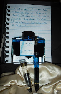
Namiki Custom 823 Clear Demonstrator

Just as Passion at The Pen Archives could marry JetPens, I have an enduring love for Namiki fountain pens.

I had read about Namiki years ago in a fantastic book by Florence Scovell Shinn, a well-known illustrator from the turn of the 19th century through the 1920s, and an equally well-known New Thought practitioner through her death in 1940. (New Thought would be roughly analogous to what we now call New Age, with a lot of focus on prosperity and abundance practices) Mrs. Shinn wrote in one of her books that she bought a Namiki fountain pen, probably in the 1920s, and every year on the anniversary of her purchase she would receive a letter from the company asking after the pen. Such dedication impressed her, and me as well, and so I had to have a Namiki. But which one?

I first saw the Namiki Custom 823 Clear Demonstrator at the 2009 NYC Pen Show while browsing Swisher Pens. According to Chuck Swisher and several other Namiki retailers, only 100 of the pen sets (the Custom 823 Clear Demonstrator with the Iroshizuku ink in Kon-Peki) had been shipped to the US. I saw several at the Pen Show, but took a better look a few weeks later at the Art Brown International Pen Shop Fair where I fell in love with the Clear Demonstrator and the Amber Demonstrator. But at that time I wanted a fine nib, and the Amber only had a medium nib. So I chose the Custom 823 Clear Demonstrator, in it's elegant sateen-linked box and complimentary bottle of Iroshizuku Kon-Peki ink.

It's a complicated pen, which I didn't realize at the time I bought it. The sales rep neglected to mention that the tail plug needs to be unscrewed in order to send ink through to the feed. Several times I ran out of ink and couldn't figure out why, until one of the StyloForum folk helped me out. Filling the converter is also an interesting experience, combining my natural clumsiness with my aversion to putting the nib and feed all the way into the bottle of ink. With the Namiki Custom 823, the nib and feed turn quite easily and can be (gently) pulled out of the section, leaving the barrel with the converter open and able to put the ink in using an eyedropper and gloves. For me, inking up this way is much easier although the first two times I didn't wear gloves, and that Iroshizuku ink is unforgiving in its pigmentation and tenacity on the skin--doesn't wash off, it wears off after several days.

This fountain pen can hold a lot of ink, and given that it's a clear barrel and cap the ink you choose really becomes a part of the whole visual experience. I'm wondering what the pen would look like with Diamine Pumpkin or Noodler's Widowmaker in the converter, how that much bright orange or red would look in the pen. The 14k fine nib is a joy to write with, it just glides over the paper without the scratchiness or tooth that I've had with one or two other pens. There are a few irritants, perhaps the only one that's noticeable is that there is some ink creep on the nib which leaves small drops inside the cap (the cap actually has a black lining down most of the length so ink drops don't show, but some ink does get into the clear area and is easiy seen).

Also, I've noticed when cleaning out the ink that the barrel does retain a slight blue color; as I was immediately adding more Kon-Peki, I didn't see whether this was a permanent coloring of the clear barrel or just a temporary situation. But I will say that the Namiki Custom 823 Clear Demonstrator is worth every penny, and is now my special "go to" fountain pen. Besides the 823 Clear and Amber pens, Namiki will be introducing an 823 Smokey color sometime early next year, and I'm looking forward to seeing that one.

Wednesday, December 23, 2009

122KCal Roll Pencil Case from JetPens


When these roll cases showed up at JetPens the most difficult thing was deciding which of the 13 colors to choose. It was a toss up between Wasabi and Love Pink, but Fortuna sent some extra cash my way and I was able to order both. The roll's soft canvas feels like silk, and the pockets are big enough for multiple large fountain pens and rollerballs. These combine beauty with practicality at a very affordable price.

Tuesday, December 22, 2009

A Few Good Books


Below are a few recommendations if you're looking for some heavy, but enjoyable, Holiday reading along with reviews (not by me).

The Ascent of Money can be a bit of a slog, and Fergusson gets starry-eyed around the multi-billionaires he (met and) writes about (Bill Gross of PIMCO comes to mind). But the Ascent of Man was made possible by the Ascent of Money and this is a great grounding in how that worked out.

Liaquat Ahamed's Lords of Finance says it all in the subtitle: the bankers who broke the world. It is an amazing book, describing what can best be called a rickety house of cards that was the global monetary system of the interwar years overseen by men devoted to (or blinded by, take your pick) the gold standard and reparations.

Finally, Tom Levenson's Newton and the Counterfeiter is a well-written account of Sir Isaac Newton's time as the head of the Royal Mint and his work in capturing (and seeing executed) one of the more notorious counterfeiters of his age. Well-written, and you can meet the author over at his blog, The Inverse Square Blog. Levenson's book was just named #5 on New York Magazine's list of the 10 Best Books of 2009.

THE ASCENT OF MONEY: A Financial History of the World By Niall Fergusson
Niall Ferguson makes a strong, compelling case for the development of money and banking as a catalyst for the advancement of civilization. Yet while some critics praised his clear, comprehensible writing, punctuated with anecdotes and historical details, others were nonplussed by his explanations and narrative detours. Several critics also bemoaned the book's choppy and uneven structure—an echo of the episodic, six-part television series it was meant to accompany. So it seems the UK critics liked the book less because they had seen the show. Though perhaps best suited to readers with a fundamental understanding of financial terms and theories, Ferguson's latest work provides valuable insight into the inner workings of the global economy, past and present. For interested readers, it demonstrates how our current fiscal meltdown fits into the bigger historical picture and laments humanity's perennial inability to learn from this history.


LORDS OF FINANCE: The Bankers Who Broke the World By Liaquat Ahamed
The parallels with our own moment are impossible to miss in Ahamed’s narrative about four members of “the most exclusive club in the world,” central bankers who dominated global finance in the post-World War I era. Ahamed, a longtime investment manager, evokes in glittering detail a volatile time of financial bubbles followed by busts, all of it guided by players wedded to economic orthodoxy.


NEWTON AND THE COUNTERFEITER: The Unknown Detective Career of the World's Greatest Scientist ~ Thomas Levenson
Sir Isaac Newton -- bookish, asexual, harboring an uncool obsession with alchemy -- doesn't sound much like Humphrey Bogart. But after his famous apple-beaning inspired a mechanical portrait of our universe that would stand unchallenged for 200 years, the godfather of the Enlightenment used his plush sinecure at the Royal Mint to wage a war on counterfeiters that demanded very real gumshoe-ing. Thomas Levenson's "Newton and the Counterfeiter" presents the physicist's vendetta against "coiner" William Chaloner as a battle of wits between a genius polymath trying to reform the British Empire's monetary policy and a dastardly native of London's criminal underworld circa 1695. A pop-science writer who has made Einstein, acoustics and meteorology intelligible to the right-brained, Levenson transforms inflation and metallurgy into a suspenseful detective story bolstered by an eloquent summary of Newtonian physics and stomach-turning descriptions of prison life in the Tower of London. Shortly after abandoning his Cambridge library for the filthy metropolis, Levenson writes, Newton "managed incredibly swiftly to master every dirty job required of the seventeenth-century version of a big-city cop." Like "Heavenly Intrigue," the 2004 book that posits that great astronomer Johannes Kepler murdered greater astronomer Tycho Brahe, "Newton and the Counterfeiter" humanizes a legend, transforming him into a Sherlock Holmes in pursuit of his own private Moriarity.

Monday, December 21, 2009

Charles & Marie Coupon Code

Since I ordered the long pen clip from Charles & Marie (which was out of stock but should be ship this week), they sent me a coupon code good for $20€ off anything you want for any order above $40€ net value. Just enter the code '20off' at checkout.

So you could get two pen clips and a pack of lcd cards and save a double sawbuck. :)

Happy Holidays!

Taccia Strata Rollerball

Adding to my collection of rollerball pens is the Taccia Strata, a new addition to the Taccia family of fine pens. I'd seen the line at Art Brown and had talked to the representative a few times, most notably at last Spring's National Stationery Show where she recognized me from the day before at Art Brown's semi-annual pen fair. When I saw her again at the Fountain Pen Hospital's pen fair a few weeks ago I stopped to say hello. Turns out she's familiar with my neighborhood, and we talked about the new Costco in Manhattan and the great hotdog-and-soda-deal the store offers. She then introduced me to Taccia's Strata line, which includes rollerballs and fountain pens.

At first I thought this was an ugly looking pen, but I didn't want to seem rude so I heard her out and gave the pen a try. And I found I liked writing with it, and was hooked. I wasn't in the mood for a fountain pen in this particular line, as it just seemed too chunky, but I definitely liked the rollerball. My favorite color was the Violet Berries (one of three looks--Niagara Falls, which is blue and cream and looks like falling water and foam, and Moss Green), so I ended up purchasing that one (and because it was a pen fair, there was a discount and I received a leather pen case that will hold at least four pens). The Ink Flow has the Taccia Strata line, while I've never ordered from this e-tailer the price is very low and the seller seems like an established company.

The Strata is made of layers of resin, which give it the unique, varying striations that can look like a waterfall or lichen or a field of berries. It's a smooth writer, and isn't as heavy as it might look. The cap has a sunburst pattern on the jewel, and the appointments are polished chrome and add a nice touch. The shape is interesting--capped it's a chunky, cigar style pen, but posted there's a nip between the end of the pen and the cap that gives it an almost hourglass shape. It's a great rollerball, a bit more than I would normally spend but really worth it.

Friday, December 18, 2009

My JetPens Order Arrived!


The latest JetPens order: two 122KCal Roll Pencil Cases in Wasabi and Love Pink; a Pentel Tradio EnerGel Combo Pen 0.7mm with a gray barrel; a Kuretake Bimoji felt tip brush pen in super fine; and two Pilot Iroshizuku inks, Syo-Ro (pine tree dew, aka deep turquoise) and Tsutsuji (azalea, aka deep pink). The Tsutsuji is already loaded in one my Pilot Namiki black resin pen, and it's a lovely color (as Bleets from Scriblets said it would be when he recommended it to me). Going to be a fun weekend, even it it does snow Saturday night.

Some Interesting Sites


Just some interesting sites I've collected that you may want to check out.

I like the idea of downloading lots of different things from the Internet, so this
site is bookmarked for further reading.

These days I don't take many notes, but this Cornell note-taking system looks amazing. My only problem is I'm just not that organized and don't think I ever could be.

For the culinary artists among us.

Finally, here's your chance to cuddle up some cold night with a plush pink Swine Flu virus.

Thursday, December 17, 2009

De Atramentis Coffee Ink

Among the scented De Atramentis inks I really wanted to try was Coffee. A rich dark brown with a hint of black in it, this straight from the bottle does smell like a very dark Jamaican or Kenyan roast--something full-bodied, not Starbucks at all. You do feel like taking a swig from the bottle it's so strong, or maybe adding cream and sugar. The faint black makes the color true to its name. No feathering that I could tell, but it's not a quick dry ink so you'll be waiting quite a few seconds. And the coffee smell doesn't last more than five or ten minutes, which is probably good.

Wednesday, December 16, 2009

Need a Stocking Stuffer? Get a Little Something.

How about something from The Something Store? I had read about this over a year ago and since then I've purchased four or five Somethings (I received gloves, a zipper bag, a black silk scarf, and a thermal coffee cup). As I needed some stocking stuffers for my parents and brother, I just sent three Somethings off to Pennsylvania. Can't wait to see what they get!

It's Called Karma, And It Hurts

Submitted without comment but with a giggle or two.

Tuesday, December 15, 2009

Muji Fountain Pen

Besides the great gel ink pens, Muji also stocks a nice aluminum fountain pen called, approriately, the Alumi-Round Fountain Pen. The Alumi-Round is a slim fountain pen with an iridium fine point nib. The pen is a matte silver color with a honeycomb grip that doesn't irritate the finger, even though it's a bit rough. It measures about 5 1/8 inches capped; 6 1/4 inches posted; and about 5 inches open, about a standard length yet the pen seems longer and sleeker. It takes international cartridges, such as the Mont Blanc black ink cartridge I am currently using but will probably also take a converter. I haven't checked to see what kind of converter it will take, as I'm content with the cartridge system right now.

The pen writes smoothly, with just a slight resistance to the Whitelines paper I used. It's a wet nib, with lots of ink flow, but there's no feathering and the line width is quite nice although it seems just a touch broader than some of my other fine point nibs. All in all, for $15.50 this is a very good fountain pen with a sleek, contemporary design that doesn't take up a lot of space and writes quite well. I don't think you could get a better fountain pen for the price.

Monday, December 14, 2009

Pelikan Pelikano

I had seen the Pelikan Pelicano fountain pen around, particularly a display at the Fountain Pen Hospital, and so decided to buy one to try out. The only one left was the clear-orange, medium steel nib but that was fine as I don't have many medium nibs and wanted to see how wide the line was. Mostly, I like this pen. The line is wider than I'm used to, but the fountain pens I've been using have finer nibs so this would seem really wide; I just have to adjust my handwriting.

What I really have a problem with is not the nib but the feed. This pen takes so long to ink up that I usually give up and find another pen to write with. I've carefully washed everything out several times since I got it about a month ago, and yet when I put nib to paper, nothing happens. Even squeezing the ink cartridge, while pushing ink through the capillary and down to the nib, doesn't last long. The ink doesn't continue to feed through, and I have to let the pen stand for a few hours to both dry out and let gravity try to get it to work. It's frustrating, as I rather like the pen and the price. But because of this dryness problem, I think I'll pass on trying one with a fine nib.

Friday, December 11, 2009

Iroshizuku Ink Update


I stopped by a Pen Show this past Saturday to check out a few items and got to talking with the Pilot representative. I mentioned that I bought Iroshizuku ink through JetPens, and he commented that they wouldn't be selling the ink for long.

Seems that the Iroshizuku inks--all 17 colors--will be coming to the US, and will retail through whoever wants them (Art Brown, Fountain Pen Hosptial, etc). The retail price will be $35; that's a problem because JetPens sells them for a much lower price. The upshot is that JetPens will be phased out of carrying the Iroshizuku ink, but I didn't find out what the time frame is.

I'd better get a few bottles of colors I've been meaning to buy but haven't yet. On the other hand, it will be nice to actually see the ink in person.

Thursday, December 10, 2009

Lamy Rollerball

There are lots of reviews of Lamy fountain pens, so I thought I'd do something different and mention the Lamy rollerball. I bought both at the recent Art Brown International Pen Shop Fair; the new purple black pens went fast, there were about 8 or 9 fountain pens when I stopped in the first day of the fair and bought my own fine point, and none on the second day when I went back for the rollerball.

This is a great pen, I'm liking it quite as much as the Tombow Object Rollerball. It's lightweight and the ink flows evenly, while the pen itself is a smooth writer. A real joy to use, although I'm so accustomed to a fountain pen that I keep thinking there is something wrong with this pen's "nib." It's a very nice, relatively inexpensive rollerball that will add some flair to meetings and to your writing.

Tuesday, December 8, 2009

For Your Information


The Fifth Carnival of Pen, Pencil and Paper is being hosted by Goldspot Pens with lots of great blog posts.

And over at Quo Vadis Blog there's a guest post by me, with many thanks to Leah Hoffman for the invitation to write something and then not minding how wordy it became.

The 100 Year Diary

Here's another unusual item from Charles & Marie, My Life Story. It's a 100 year diary for you to record the events of your lifetime. While there's no indication of how many pages, the size is 9"x7"x3" (23 x 17 x 7 cm) and it costs $65.

My Life Story will help you to remember the special moments in your life, the people you have loved, the friends you have made, the places where you have lived and those you have traveled to. You can record your achievements as well as your skills, make a note of favorite films/books/music/people and write down all your ambitions and things you want to do before you die. A map of the world and one of your body is included and can be filled in as you choose. Every year you can write about what important things are happening in your life and include photos and memorabilia...

To make it easy to start, it comes with a couple of chapters, the rest is for you to fill in.

Topics are:

* about me... facts about yourself

* world map... where you have lived and travelled to

* education... your schools and qualifications

* awards and achievements... prizes, medals, trophys

* useful and useless skills... all the skills you have learnt in life

* jobs... places you have worked

* 50 things to do before you die... your own life ambitions

* homes... where you lived and who with and a few others which we won't mention here...

Monday, December 7, 2009

Osmiroid Nibs


I spent a good part of a Sunday morning walking around The Garage, a flea market held on Saturday and Sunday from 9 to 5 at, what else, a garage located on 25th Street between 6th and 7th Avenues. There's an amazing variety of items for sale at different booths, including lots of vintage clothing, posters, books, jewelry. But I was on the hunt for fountain pens, and that seemed to be the one category lacking at The Garage. However, at one of the tables I found this pack of six fountain pen nibs for $10. They are Osmiroid nibs, which I'd never heard of--six nibs total, a nice selection of two broad nibs (the B3 and B4, which look like music nibs), two italics, a broad point, and one called "Mari 2." Once I got home I did some googling and found that the Osmiroid company was founded around 1918 but had roots in the fountain pen and nib industry dating back to the 1820s.

These nibs seem to be made for the Osmiroid '65 and '75 fountain pens. A little more googling and I was pleased to learn that these nibs will fit in Esterbrook pens with a lever fill system. So I pulled the nib out of my Esterbrook and started trying out the Osmiroid nibs, which do fit perfectly. Unfortunately, my girl cat Seranne also liked the nibs, and while I was preoccupied for a few minutes with something else she decided to play with the B3 nib. The nib mostly survived, but the right side tine was slightly bent and I've been doing a little repair work trying to get it back into place. I've only tried out two of the nibs, the B3 and the Mari 2, and definitely like these. They are really flexible nibs, more so than I've ever used before, and I can't believe how far the tines move apart when I put point to paper.

For some reason, the nibs feel like they are pulling to the right--as if the right side is loose or slightly bent, even though that's not the case. But I notice that the right side of the nib "leans" and I'll have to do some additional playing to get used to the way the nib feels. Perhaps this is how a flexible nib feels? Or maybe it's just me and the way I'm holding the pen. But with other nibs, all hard as nails, I don't feel that pull to the right. Strange, but not so irksome that I don't use the nibs.

Saturday, December 5, 2009

Congrats to the Giveaway Winners

First, thanks all for coming over and leaving a comment. I didn't think anyone would, so I was really happy to see everyone. I liked doing this, and wil have a few more in the months to come.

The random number generator came up with

18 1

Random numbers generated Dec 5 2009 at 8:47:27


And so the winners of the first Pocket Blonde giveaway are comments 1 and 18--bleubug and VEGAS PENS.

bleubug said...
Well, I don't carry baguettes too often but I think these look neat.

VEGAS PENS said...
Awesome! I'm also in, plus I Tweeted about it. I hope I win! :-D
http://www.twitter.com/vegaspens


Send me an email at diane.fennel AT gmail.com with your shipping information, and I'll get this out to you right away.

Friday, December 4, 2009

De Atramentis Ebony Ink

I saw this at Art Brown International Pen Shop and was really taken with the color. Ebony would normally be an intense black color; ebony wood is a dense black, one of the few woods that will sink rather than float. But this ebony is purple-black, with a definite brown tone to it. I've swatched it next to De Atramentis Bordeaux Red and J. Herbin Perle Noir to get a sense of the red and black in this ink. It's a regular ink, not bulletproof or waterproof and not one of the wine/whiskey/scented De Atramentis inks. Just color in a bottle. And I like the color mix of this Ebony, so I loaded up my new Pilot Namiki Falcon SF nib to try it out.

This particular fountain pen is very wet, so it's a good one to use to get a sense of the color and shading of De Atramentis Ebony. As the pen is so wet, I can't get a sens of how fast the ink dries, but it does take some seconds so this might not be a good choice for a left. The flow isn't as good as I'd like, but the pen's converter developed a vacuum that kept the ink from moving into the feed. Once that was taken care of, there was a lot of ink at a continuous flow. There is no feathering that I can see, no bleedthrough or shadow on the other side of the paper (Rhodia #16 pad with 90gsm paper), and good saturation. All in all, a very nice ink if you want a deep purple-black with dark brown shading.

Wednesday, December 2, 2009

Pocket Blonde's First Giveaway


Back in October Leah Hoffman at the Quo Vadis Blog came upon an unusual tote bag at Fish's Eddy, one of New York's most interesting stores specializing in dishes, siverware and all things kitchenesque. I stopped by and picked up some of the notebook-themed items, including a few extra tote bags I thought I'd keep for a giveaway. And that day has now arrived.

The First Giveaway: Two Fish's Eddy Notebook Tyvek Notebags

Size: Slightly bigger than a Rhodia No 18 notepad (8.5 x 11), a good bag for carrying baguettes or carrots.

The Rules:

1. Leave a post in the comments section, one post per reader please, by 11:59 pm Friday, December 4, 2009. Feel free to link to this giveaway on your blog, or share it with others who love notebooks and/or totebags.

2. Two winners will be drawn at random using a random integer generator, and the winners' comment will be posted on Pocket Blonde on Saturday morning. You will have one week (to December 11, 2009) to contact me.

3. I will ship internationally, so please don't hesitate to enter if you're outside the US.


Enjoy!

Tuesday, December 1, 2009

A Pen Clip For Your Notebook


Here's a useful stocking stuffer: it's a clip that you can attach to pretty much any notebook or folder or diary of your choice. Once attached to, say, a Moleskine, you can then attach a pen or pencil to it. The Pen Clip comes in two sizes, and at a reasonable $16 is available from Charles & Marie.

Monday, November 30, 2009

xFountainPens.com Coupons and Gifts

I like this seller, xFountainPens.com, and as they have coupons and gift-with-purchase deals through Friday, December 4, I thought I'd pass this along.

GET YOUR LOOT!For this week only we have several active promotions. These promotions will COMPOUND with each other… so you can use them all at the same time to multiply your savings! First check the promotion description, then read the note below to learn how to qualify.

The Loot: Get free shipping on your order!Here’s how: First, add at least $15.00 worth of items to your cart. Then, during checkout select “Free Shipping” that is available for all packages shipped within the United States.

The Loot: FREE bottle of Chesterfield Ink!Here’s how: Add at least $35.00 worth of items to your cart. Any items will do! Then, add the Chesterfield Ink bottle of your choice to your shopping cart. After they have been added, enter CF44 in the coupon code box and click “apply”. Your ink bottle or cartridge tin is now in your cart for FREE! (you should see the savings reflected immediately.)

The Loot: Get the NEW X750 Damestein Fountain Pen (right) FREE!
Here’s how: First, add at least $50.00 worth of items to your cart [cart should have this amount before adding the promotional pen]. Then add the X750 Damestein to your shopping cart. Once the item has been added to your cart, enter DAME in the coupon code box and click “Apply”.


BONUS Loot: The coupons below will also be active* until Friday, Dec. 4! Use one, or use them all at the same time!

Discount code: X450
Loot: $5.00 Off the X450 Collection

Discount Code: SG2400
Loot: $15.00 Off the SG2400 Collection

Discount Code: X750
Loot: $10.00 Off the X750 Collection

Discount Code: SG2500
Loot: $10.00 Off the SG2500 Collection

Discount Code: NEBEL
Loot: $2.00 Off the X450 Nebel Flake Pen

Discount Code: GIFT
Loot: $5.00 Off a set of 5 wooden gift boxes

More Great Giveaways

The Pen Addict, aka Brad, is celebrating his Second Blogiversary with a great JetPens giveaway, three fabulous prizes. Stop by and add your comments.

Nifty at Notebook Stories is also giving away three fantastic Moleskine goodies. Head over and check it out, he's the creator of the popular Carnival of Pen, Pencil and Paper.

Swisher Blue Black Ink

I have really fallen in love with blue black inks, especially gel inks such as the Pilot Hi-Tec-C refill. It's a color that's not too harsh (black) or too soft (blue) but just in between. I'd read that the Swisher inks were quick-drying and very good, so when I was placing an order recently I decided to give the Swisher Blue Black a try. The 3 oz. bottle is quite reasonably-priced at $8.75, another reason to add this to my checkout cart.

The pen I'm using is a Sailor 1911 Medium with a fine 14K nib with converter. The Blue Black flows nicely and dries almost instantly--no spots or streaks or stains. Written on Clairefontain 90gsm grid paper, you can really see the blue black color even when using a fine point nib.


The Swisher Ink is a dark black with blue, or maybe dark blue with black. The mix is so even that neither color dominates, but I seem to see some green shading (no doubt due to the blue). I like this ink a lot, definitely one I'll keep in the rotation. Now I'll have to look at a few more blue-blacks, such as Noodler's Ellis Island Blue-Black (from Fountain Pen Hospital), Noodler's Starry Night (from Fountain Pen Network, and De Atramentis Sherlock Holmes (which isn't available-yet, I hope-in the States). The only negative is a slightly chemical smell that lasts a moment or two, and is noticeable when your nose is close to the ink. It dissipates quickly and is only a very minor flaw in a beautiful ink.

Saturday, November 28, 2009

Gift Guide and Giveaway

Lung Sketching Scrolls has posted a Holiday Gift Guide and JetPens Giveaway. Leave a comment by December 12, and you're entered to win $10 JetPens gift certificate. Check out the gift guide as well, great items being showcased.

And if you come back here on Wednesday, you'll also have a chance to enter Pocket Blonde's first giveaway.

Friday, November 27, 2009

Things I Meant to Post But Forgot, Pt. 1


Taken back in mid-October, an installation in the window of Kate's Paperie on W. 13th Street. A skeleton and other Halloween items (pumpkins, etc.) made from wood and book pages.

Thursday, November 26, 2009

Happy Thanksgiving


Brightest Blessings to all on this day.


I saw this single rose yesterday in one of the neighborhood gardens, all brown and winter bare, and admired its courage and nonchalance. :)

Wednesday, November 25, 2009

Twist Ring Note


On a recent trip to Kinokuniya I spotted an unusual notebook, the Lihit Lab Twist Ring Note in B5 size. I'd seen OfficeSupplyGeek's review, and was curious to try this. The concept is to gently pull open the opposite ends of paper at the top left and bottom right of the rings. This opens up the binders, to add or remove pages. It's a great concept, and the packet from Kinokuniya included refill pages. (Unfortunately my pictures didn't turn out too well, but OSG's review has lots of snaps to enjoy.)

I was a bit nervous the first time I pulled on the paper, as I thought I'd need to apply more pressure than what turned out to be necessary and that would rip out the pages. No such thing, the rings opened up right away and snapped shut with a very satisfying click. The square holes remind me of Doane Paper's journals, but unfortunately the Lihit Lab's paper is punched with many more holes in it than Doane's. The paper has a soft feel to it, like Clairefontaine, and probably plays well with many pens (I'll try it out later). All in all it's a lot of fun and relatively inexpensive (about $7.50 if I recall correctly).

Tuesday, November 24, 2009

Pilot Hi-Tec 0.5m (not the Hi-Tec-C)

A few weeks ago I tried out some needle point Zebra Sarasa Stick Pens. While I liked the point, I didn't like the tiny 0.3m line. Looking through my pens the other day I found what I thought was a Pilot Hi-Tec-C 0.5m that I had bought but never taken out of the cellophane wrapper, a violet to go with the blue black one I really like. I unwrapped it and absently started to write a note, only to stop short and take a really good look at the pen. That's when I discovered it's a Pilot Hi-Tec, not a Hi-Tec-C; it has a needle point and a 0.5m tip and writes like a dream!

I bought the pen at Kinokuniya a few months back, but figured the violet was just like the blue black so I didn't use it right away. This is everything I wanted in the Zebra Sarasa 0.3m but didn't find--a wider line and smoother writing. I like the way the needle point looks when it's scrolling across the Doane Paper; the grip is comfortable but not padded in any way. I'm definitely going to purchase a few more of these in different colors, starting with my favorite blue black color.

Monday, November 23, 2009

Namiki Black Celluloid Fountain Pen

This is my black Namiki celluloid fountain pen with the beautiful rose-pink and blue shimmer. I think I fell in love with the colors first, although I was definitely looking to buy a Namiki pen when I browsed the Swisher Pens booth at the 2009 NYC Pen Show. I definitely love this pen, and it was not as expensive as I thought it would be, although it was not in the Lamy Safari category either (Chuck Swisher gave a very good price on this, btw). The gold clip and ring are beautiful highlights against the black, and it's a very lightweight pen that moves smoothly over paper. As I'm partial to fine nibs, that's what this one is sporting.

What makes this really interesting is the converter, the CON-70, a vacuumatic filling system that sucks in the ink one pump at a time. And that's where I have my one problem, as I'm not a big fan of this system (yet, I suppose). I don't like sticking the nib and feed into a bottle of ink as it is, as I have a tendency to move the pen, which moves the bottle, which in one memorable case led to a nearly new bottle of J. Herbin Poussiere de Lune all over my kitchen floor. I also don't like filling this way because ink gets all over the inside of the nib, and then comes gushing out when I'm writing. What I have started to do is to remove the nib and feed, take an eyedropper full of ink and put some in the converter, then pump--the ink drops down into the converter. Three or so times will fill the converter, and I'm not pumping away worried I'll damage the nib or spill the bottle.

I love writing with this pen as well, and haven't had any problems such as skipping or "dry writing" where the ink won't flow when you put nib to paper. The fine point has just the right width of line,; I have noticed that when I begin writing, the line is much wider and more ink is flowing, then when I'm a paragraph in I get a drier, finer line--as if I need to write a bit to get the pen in the mood for writing just the way I want.

The pen is about 5 1/4 inches capped, 4 1/2 inches uncapped, and about 5 3/4 inches posted. While it's slender, that's relative--it's chunkier than my Pelikan M205, but not as wide as my rOtring Surf pens. And I have noticed ink settling on the nib, seeming to come out of the tines. That may be my fault for taking the nib and feed off to fill it and not replacing them correctly, or the pen itself allows it and is just a wet pen in more ways than one. A minor point, over all, as I wouldn't trade this pen for anything--unless it was for another Namiki!

Thursday, November 19, 2009

Noodler's Henry Hudson Blue for FPH

Noodler's other new ink for the Fountain Pen Hospital is Henry Hudson Blue (HHB), which from the picture I posted the other day I took to be a dark, cold, intense blue. So I was really surprised when I decided to swatch the color next to Noodler's Manhattan Blue, an Art Brown exclusive. HHB has a lot more purple in it than I originally thought, it's definitely not a pure, cool blue as it seemed from the liquid in the cap and bottle. Next to each other, I find I really like the Manhattan Blue color a lot.

Writing with it, the ink is quite nice although my Pelikan M205 fine point was definitely in a bad mood and really resisted the Rhodia notebook. I don't think it was the Noodler's ink, as the one I flushed was Noodler's Widowmaker, which the pen really liked (as do I). And the HHB takes so long to dry, something that I hadn't noticed with the Old Dutch Colony Sepia because the Moleskine Reporter Notebook was absorbing the ink like crazy. On better quality paper, I couldn't believe how long the HHB stayed wet. Not a great option for lefties, I'd say.

I do like the picture on the bottle, early New York before the European invasion. And I do see now that this snapshot does show how intense and bright the HHB is, although not the purple shading. But I am wondering how this particular blue was chosen to represent Henry Hudson--is there something particularly Dutch about it?