Tuesday, August 30, 2011

Guest Post: The World in a Ballpoint Pen, by Jack Labusch

My ballpoint pen . . . that’s my laboratory!

We have a lot to thank theoretical physicists for. They’re different, though, right? Well, maybe not so much. Here’s Physicist Richard Feynman on a new malady you may recognize that he first saw in one of his Manhattan Project colleagues at Los Alamos.

“ . . . [Stanley] Frankel eventually suffered from ‘computer disease’, a preoccupation with using the computer itself rather than running designated problems on it. This disease interfered so much with his functioning in the implosion program that [Hans] Bethe in March 1945 asked Feynman to take over the computation group.” (Credit: Critical Assembly, by Hoddeson, Henriksen, et. al.)

Above is Physicist Julian Schwinger in 1965, shown in his home after winning the Nobel Prize in physics along with Feynman and Shinichiro Tomonaga. I can’t identify the pen, and the body language seems incomprehensible to this onetime salesman. Anyone want to take a shot at interpreting the photo? (Photo found on Wikipedia. The original caption reads: “His laboratory is his ballpoint pen”.)


Monday, August 29, 2011

Rollerball Pen by Miquelrius


One of the items in my recent Lost Crates shipment was this flowery 0.5mm rollerball pen by Miquelrius with art by Joshua Davis. The design is lovely, lots of flowers in white, orange, and blue on the barrel of the pen, while the large dark blue cap has a spacious clear plastic window to check the ink supply.


This is one of the smoothest rollerballs I've used, the ink flow is sustained so there's no skipping. You can almost feel the ink coming down the cartridge that's how much flow this has, and the deep, true blue color of the ink is different.

The only negative I can think of to this pen is that it isn't reusable. Other than that, if you happen to see one at your stationery shop give it a try.

Saturday, August 27, 2011

Waiting for Irene


Left work early yesterday to get to the store for the weekly groceries (there were people buying 8 and 10 cases of bottled water, my thoughts on that are not pretty).

The entire transit system shut down at noon today, it is very strange not to see any buses on the avenue. I live in Zone A, the evacuation zone, about a quarter mile from the East River. I'm confident the surge won't get over the promenade (10 to 12 feet above the river), and the cats and I will be okay. But if Irene actually came over NYC rather than near us my fourth floor apartment would be oceanfront property.

The above is of Irene on August 22, 2011 courtesy of NASA.

Friday, August 26, 2011

R by Rhodia No. 12 Notepad


Many thanks to Karen Doherty, VP of Marketing at Exaclair, for sending me one of the new R by Rhodia No. 12 notepads. It has the new soft touch cover with an orange front and black reverse for a great contrast. And I love the "depuis 1934" on the cover as well, really highlights the French origins of this notepad as well as the company's long history.


This is one of the cutest sizes, 3 3/8 x 4 3/4, which is perfect for purse or knitting bag. The paper is an amazing ivory color, really beautiful with a deep gray or violet line (can't quite tell). I'm thinking that I am going to love the larger sizes of this, and I am definitely looking forward to getting a few of them to try out.

Wednesday, August 24, 2011

BIC 4 Color Soft Grip Ballpoint


The original BIC 4 color was a staple of my school days, but I never really liked it. The barrel felt too big in my hand, and I wasn't fond of the blue and white color combination or the plastic ball on top. The revised version has a loop at the top so you can carry it on a lanyard or perhaps a key chain. At Easter the 4 Color turns pastel, which is a nice touch.

When Office Supply Geek reviewed the new version of the BIC 4 Color I did take notice of the black and grey combination, but didn't really look for it on my shopping trips. Then I saw on at Staples, and as there was a sale I thought I'd give it a try.

As the Geek mentions, the new BIC 4 Color touts a soft grip barrel that actually has a matte hard plastic grip on it. The prior versions had round, smooth barrels with no grip function at all. This actually is noticeable and makes the ballpoint feel better in my hand as I'm holding something that is easy to catch onto rather than sliding down my fingers.


Next to my Hi-Tec-C Coleto you can see that the BIC is slightly longer, and lacks the space alien profile of the former. The BIC ink refills are described as 1.0 medium tips, which for a ballpoint sounds about right. You can get fine tip refills for the BIC if you want to change the style, or try hacking a Hi-Tec-C refill.


As for writing, three of the four colors (Red, Black, Blue) wrote smoothly with a lot of flow immediately. The green was a bit on the pale side, and felt like I was pushing it through dried cement. Too much effort for that one, so I may either skip green or try a single refill and see how it works.

Like multi pens and want something with a sleek profile? Give the BIC 4 Color Grip a try.

Monday, August 22, 2011

Target Up & Up Retractable Gel Ink Pens


This pack of four rollerball pens from the Target Up & Up line of office supplies caught my eye and the price was especially attractive ($3.47), so I popped a pack in the bag for later use. Like the Pilot G-Knock and the Zebra Sarasa, these molded plastic pens have subtle curves and a large rubber grip for comfortable writing.


The Target rollerball has a 0.7mm width stainless steel tip, with a deep black ink that flows smoothly for a great line. In a comparison with the the Pilot G-Knock, there was no difference in the writing, as you can see above. The Target Up & Up is slightly longer than the G-Knock, and had slightly different design curves. But the rubber grip is the same, down to the cartouche on the side.

These Target rollerball pens do seem to be as good at the Pilot G-Knock, and at a lower price point. The only drawback is the color choices, blue or black. Would turquoise or burgundy be too much to ask? If you are browsing the supplies at Target, definitely add a pack to the carrier.

Friday, August 19, 2011

Uni-ball Alpha Gel Slim Ballpoint


The Uni-ball Alpha Gel Slim Ballpoint has a grip that reminds me of the Sensa pens, but it's made out of some type of springy rubber that springs back into its original shape like one of those stress balls.

I like the design of this ballpoint, it's slim only in comparison to the regular Uni-Ball Alpha Gel pen. Otherwise, there are lots of curves to this pen starting with the grip and continuing through the barrel and the clip.

It's also a big pen, measuring 5.75 inches with the plunger fully extended, about a third of an inch longer than my burgundy Zebra Sarasa.

(Just a note that while I adore JetPens, they are selling these Alpha Gels for $13.50 while Tokyo Pen Shop has them for $10. TPS offers free shipping on orders of $25 and up too, and they just added fountain pens to their lineup so do go over there and browse around. I've ordered several times from TPS and found them reliable and fast.)


I can't tell from the packaging if this is a 0.5mm or 0.7mm tip, while the pens are usually marked on the clip or plunger this one isn't. Nor is the ink refill above, so I'll have to guess that it's a 0.7mm (not a 0.5mm as I wrote above).

Something I hadn't noticed before that's a great little detail is the small piece of cotton at the end of the ink refill, which would keep ink from escaping the back. I'm not sure when this would be needed (high altitude?), but it makes you appreciate how much attention to detail is paid on all aspects of these Uni-ball pens.

The royal blue color accents are nicely place, with a darker blue on the tip of the clip and the end of the barrel as well as the top of the plunger and a more powdery blue coloring the grip. The pen is actually very light in the hand even with the metal barrel, and writing takes very little effort.

Looking for a ballpoint in the $10 to $15 range, something that looks good and writes well? Here's a great option for you.

Wednesday, August 17, 2011

Moleskine Le Petit Prince Notebook

Antoine de Saint-Exupéry's classic Le Petit Prince was published in 1943, has been translated into 190 languages, and has sold 80 million copies. I can't help but think that a large part of the novella's appeal are the wonderful illustrations done by Saint-Exupéry of the Prince, his planet, the Baobabs, and his Rose, among others.

In April 2011 Moleskine released Le Petit Prince special edition notebook featuring the Saint-Exupéry drawings in two motifs and four styles: pocket and large, lined and plain paper. Each cover is engraved in silver with one of the illustrations (on the large plain paper notebook above it's the Prince on his planet, with volcanoes and flowers) and the line "L'essentiel est invisible pour les yeux."

The front inside cover shows the desert at night, with all the stars and planets.


Instead of Moleskine's signature "In case of loss, please return to:" and "As a reward, $___" you have this charming variation including planets and secrets.

Between the front and back is Moleskine's beautiful cream paper. There's something about a blank sheet of fine paper that's inviting and daunting and a bit frightening, like a ferris wheel.

The back inside cover has the Moleskine pocket, and inside is an illustration of the Prince as well as the Fox. Instructions show how this can be made into a standing tableaux.


And the final sentiment that anyone who carries a Moleskine will agree with, although Field Notes has a variation about not writing it down to remember it later but writing it down to remember it now.

Charming and beautiful, if you're interested Amazon has them at a slightly reduced price.

Here's the Moleskine Le Petit Prince video that features the Pocket lined notebook.


Tuesday, August 16, 2011

Pouches! (and Shoplet's Giveaway)

Thanks to Shoplet's blog for pointing me to Invite.L and their amazing assortment of colorful pouches. Someone else likes Field Notes I see.

Shipping is $7 flat rate, but I can't tell if that's inside the US or not (although the blog has a ".us domain). The company itself seems to be registered in Korea; I may have to just email to find out what the story is on US orders.

Sometimes I think it might be easier to get a group together and split the costs for certain really cool non-US companies (I'm looking at you, Notemaker). If anyone would be interested in joining me on that, let me know.

Also, take a look at Shoplet's weekly giveaway, this week feature's 12 Avery backpacks, which I didn't know they made.

ACME at Art Brown International

Nancy Olson, Ink has a great post on ACME's debut at Art Brown International Pen Shop. If you're in the neighborhood do stop by and check out ACME's offerings and their elegant display.

Monday, August 15, 2011

Monteverde Artista Clear Demonstrator Kit


I had noticed this Monteverde Artista Clear Demonstrator on sale at Art Brown's web site for some time, but only recently stopped by to pick one up. I love clear fountain pens, there's something really fascinating to me about seeing the inside workings of the pen as well as being able to tell rather than guess how much ink is left.


The kit includes a beautifully-designed box with a white satin-style lining that puts me in mind of a coffin (sorry, but it does!). There are 12 Monteverde ink cartridges in various colors included in the kit, as well as a twist converter if you want to use a bottled ink.

The pen is made out of clear plastic, with a lot of silver accents. The clip is pretty wide, and hooks easily so there's no fumbling with the fastening that leads to the pen falling out of a pen roll. The converter end is white, which adds an additional nice accent.


The Artista Clear Demonstrator has a medium nib, but it's not as wide as some mediums I've used and I find I like this line width, and the pen itself, quite a lot. The pen feels good in my hand, not to0 small or long, and for whatever reason I really enjoy writing with it. There's not as much skipping, although paper quality does have a lot to do with that, and I haven't had any dry starts indicating the nib is probably exposed to air and drying the ink. I am probably gong to have the nib re-ground to a stub, as I think that tip would go well with this pen.

If you are looking for a clear demonstrator to add to your collection then I would say this is a great choice, especially as it is on sale and there were about a dozen or more available a week ago.

Thursday, August 11, 2011

Goldspot Pens Reviews the Pilot Knight Ballpoint

Nice review of the Pilot Knight Ballpoint pen over at Goldspot Pens. While I'm partial to the Fountain Pen version, it's great to see the Ballpoint get its due.

Lost Crates August 2011


My first Lost Crates subscription arrived and I'm really pleased to see the colorful items added to the list.


The way this is packaged adds to the nostalgia, brown paper tied with string. I'm waiting for Sam Clemens to come along with a pocket knife and open it for me at the knot, saving the string for whatever use he may have on the Mississippi.


Primary colors seem to rule this group, now I'm thinking I may have to re-take the test and add the paisley or plaid sample to see what shows up next.

I'm pleased with this first Crate, which is anchored by the large Moleskine journal. The contents are:

*one bright red, blank Moleskine journal

*one bright yellow New York State Field Notes memo book

*one bright blue Made by Humans Eco Stapler (really looking forward to trying this)

*one Joshua Davis blue rollerball from Miquel-Ruis

*two Pop Ink blank memo books from The French Paper Company.


Wednesday, August 10, 2011

Uni-ball Jetstream Stick Rollerball


With all the back to school items piled high in stores across the country, finding a pen that would be to your liking should be pretty easy. I saw these Uni-ball Jetstream 101 stick rollerball pens at a Shop Rite and was definitely interested. I love the spare design and length of stick pens like the BIC Stic and Paper Mate ballpoint stick pens. The pen just seems to feel, and look, better in my hand. And having a Jetstream option in a rollerball featuring their proprietary Super Ink was just perfect.


I was surprised to find out that the pen is refillable, although it has one of the longest refills I've ever seen. The plastic barrell is round with a beveled end so that it fits into the cap with a very satisfying click. No lost pen caps for this Jetstream.

At 1.0mm this Jetstream 101 has a very wide tip and is great for larger writing needs. If you're a teensy Rhodia or 3M sticky you may want to get a needle point rollerball instead. Although refills can obviously be in the size of your choice, and I'm thinking a Hi-Tec-C 0.5mm would fit just fine so I'll be trying that one out soon.

What about the ink? It's smooth, and the pen absolutely glides over the paper. I think this is one of the smoothest rollerball inks around, and it doesn't smear so fast writing is fine. Unfortunately my camera didn't feel like taking a picture of my writing sample, so you'll have to take my word on this.

Price is good, $3.89 plus tax for a 3 pack so you're not breaking the bank trying out this Jetstream. And as it is refillable, you can reuse the sticks with the refill ink and width of your choice. The Jetstream 101 is a lot of pen for the money, if you see them at your local back to school sale you might want to add a pack to your check-out.

Tuesday, August 9, 2011

The Occasional Rant

Sometimes you look at a situation and wonder "do these people know they are pointing that AK-47 at their own feet?" The Tea Party people make me ask that question.

(Which reminds me of another comment made some years ago by a foreign journalist about the New York Times' lengthy, agonized, and ultimately boring account of how they got the WMD/Iraq story wrong, and went something like "why do they shoot themselves in the b@lls?").

This Kevin Drum post from Mother Jones is an important read, as is the LA Times story he links to regarding the probable losers in the budget-cutting battle to come.

Another good map and discussion, from the Economist, really shows where the money comes from in the US and where it goes.

When the Tea Partiers and their friends stop cheering the US downgrade (and why S&P should be believed on anything, given their role in giving triple AAA ratings to asset backed securities and other questionable financial items), they may come to realize that the budget cuts are going to hurt them much worse. At which point they'll get angry at all those elites like Obama who took away their country, which they want back right now.

August Carnival Time


August always makes me think of the Great Allentown Fair, so I'm in the mood for a carnival. Peaceable Writer is hosting the August Carnival of Pen, Pencil and Paper and there are a lot of great posts so go take a look (especially the post on seven brown inks).

Monday, August 8, 2011

Noodler's Black Swan in Engish Roses

The second of the Black Swan inks is Black Swan in English Roses, which is much different from its Australian cousin (as you can see in the picture to the right that compares the two Swans).

English Roses is a deep, bright burgundy, reminding me of the wine inks of De Atramentis. It has more in common with a poppy than a rose (as Nathan Tardiff notes in his video). The ink's shading is beautiful but understated to my eye.

By contrast, Australian Roses is a black cherry color, and has a much heavier shading quality to the ink. It's a much darker color and doesn't have the brightness of English Roses.

Drying time is neither very quick nor very slow, just a regular Noodler's ink drying on the page. The paper I used isn't in the Rhodia/Clairefontaine category, but a bit better than copy paper.

The Roses inks aren't waterproof, but I was surprised at how well they held up when water was poured over them and then rubbed into the writing.

Definitely take a look at the video, the art work and explanations of the process behind the ink are always worth watching.

Thursday, August 4, 2011

Rhodia Bloc No. 120 Rainbow Notepad


I saw this Rhodia notepad in a post and was really taken with the rainbow colors of the paper, so naturally when I placed an order at Writer's Bloc I included a No. 120. I had seen the rainbow assortment in some wire bound Clairefontaine notebooks, but not in a Rhodia.


The No. 120 is larger than the No. 18, but is the same size as the No. 19 (8.25 by 12.5) that you can find in yellow lined paper or dotPad . There are 80 sheets of 80 gsm, 5x5m gridded paper in blue, bright yellow, pink, and mint green for you to choose from.


This is one cool design, and the larger paper makes it ideal for writing, doodling, notetaking, or whatever you usually do with A4 sized paper. You could keep notes segmented by color, and as the paper is three-hole punched you can add it to a binder.

I've noticed that when I don't quite know what use I'll make of something before I buy it I tend to find half a dozen uses after I've made the purchase. Inspiration is still coming to me, but I've started coming up with some plans for this that make it a necessary part of my daily arsenal. This may be the case for you, so definitely check out the Rhodia Bloc No. 120 rainbow notepad.

Wednesday, August 3, 2011

The Magical Appearing/Disappearing Uni-ball Jetstream


About two weeks ago I came into my office and found a Uni-ball Jetstream rubber body pen on my desk. What was unusual is that it wasn't mine, as I use other Jetstreams but not this one. I'd lucked out--instead of someone walking off with one of my (more upscale) pens, someone left one of her (more upscale) pens with me.

The Uni-ball Jetstream rubber body is a great looking pen and I started writing my notes and doodles with it. Smooth ink flow, didn't smear, nice barrel, the 0.7mm width not too wide, and the rubber coating that feels a bit softer in the hand.

Last night I decided I'd write a review of it for the blog, and get it officially on the #dailyarsenal list. I brought my digital camera in with me to take pictures, only to find...no pen. It was on my desk, now it's gone.

Perhaps it is a Quantum Jetstream, only in one place when you are focusing your attention on it. Or perhaps one of my co-workers left it on my desk a few weeks back, then saw it yesterday afternoon and took it back. Not a problem, but it does raise one question: who is coming into my office looking over my desk after I've left for the day?

Another post will be up shortly, but if you like gel ink pens and Jetstreams then try out this rubber body pen.

Monday, August 1, 2011

iTunes Moleskine App

The iTunes Moleskine app looks fantastic, just as if you had a Moleskine at your fingertips to write or draw in, like Hemingway or Monet or Klaatu the robot (maybe one of those--Monet?--didn't actually use a Moleskine, but that's not the point).

To start, you can change the color of the ribbon around the cover to match whichever type of Moleskine you want. This doesn't actually do anything other than making the app look more real and attractive, but that's quite all right. I chose yellow, but you can get red, orange, green, purple, or any of the other shades available.


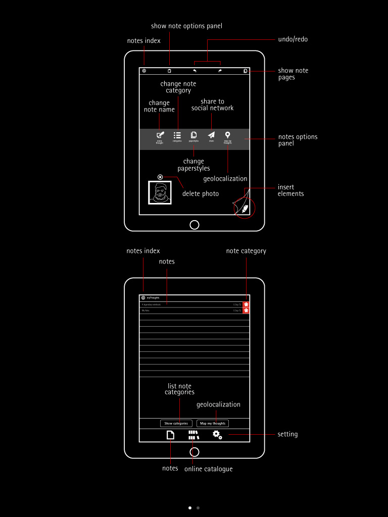
You start by creating a thought, which is dated and can be given a category (that's the asterisk icon on the right). This page seems to start out lined, but you can choose what type of paper you want to write on through the menu. And there are lots of menus!

This menu at the start of your throughs lets you choose Text, drawing, or adding a picture. The problem I had was that while I wanted Text to type in my thoughts, I couldn't get past the drawing part of the app. Something was wrong, so I went to the help section (which is the lighbulb on the top right of the pages).

Page one of the help info gives me all sorts of useful data, but how do I get to using Text?


Page 2 tells me how to turn Text on, so why isn't it working? Nowhere does Moleskine mention that if you tap twice on the iPad it will bring up the keyboard so you can type rather than write or draw your text. I found that out by accident, as I was absent-mindedly tapping on the app trying to figure out what was wrong.

Unfortunately, once I brought up Text I couldn't figure out how to switch back to the drawing part of the app, so I went into another menu to look.

This menu lets you choose the way your pages look, categories, and sharing your thoughts by emailing the page.


This is a view of how to change the4 paper, from grid to plain to lined. It's a deep ivory color, which I haven't found a way to lighten and don't thing you can.

When I was doodling around with the drawing app this message came up--if you want to write something (like you would in a Moleskine with a real pen rather than a capacitative instrument) this function mimics text to smooth out your writing or printing and make it legible. You have still written something, but now you can read it.

Here's the keyboard for Text writing, which I was glad to see. For people who would like to draw, there is a major problem in that the Moleskine app is portrait only. A landscape function would be great for artists and dabblers.


My handwriting on surfaces like this (such as the FedEx and UPS devices) isn't that great , although the smoothing-out function made it look better. One problem is that your hand rests on the iPad as you write, and so you can leave lines and squiggles on the page. Doesn't seem to have the hand-rest function I've seen on other notebook apps, where the screen basically becomes frozen so you don't pick up any extra lines.

The Moleskine app is beautifully designed and looks fantastic, just like a real Moleskine. But it is unwieldy (the reviews on iTunes are pretty brutal) and needs more work and better instructions. It's free, however, so if you're looking for a way to keep a Moleskine on your iPad and have a lot of time to figure out how it works (and the online instructions are no better than the ones show above) then you probably want to take a look at this.